Art & Design Review: Print Art Direction & Editorial Design
About
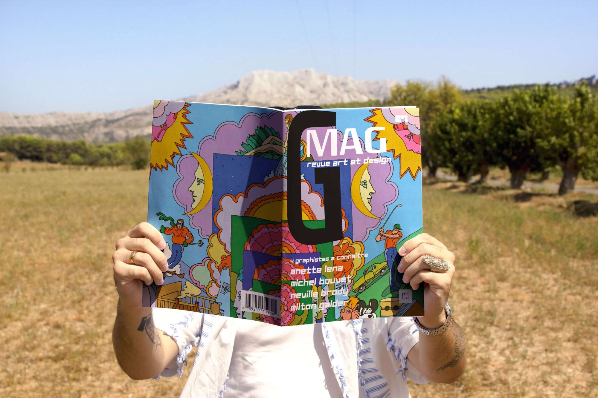
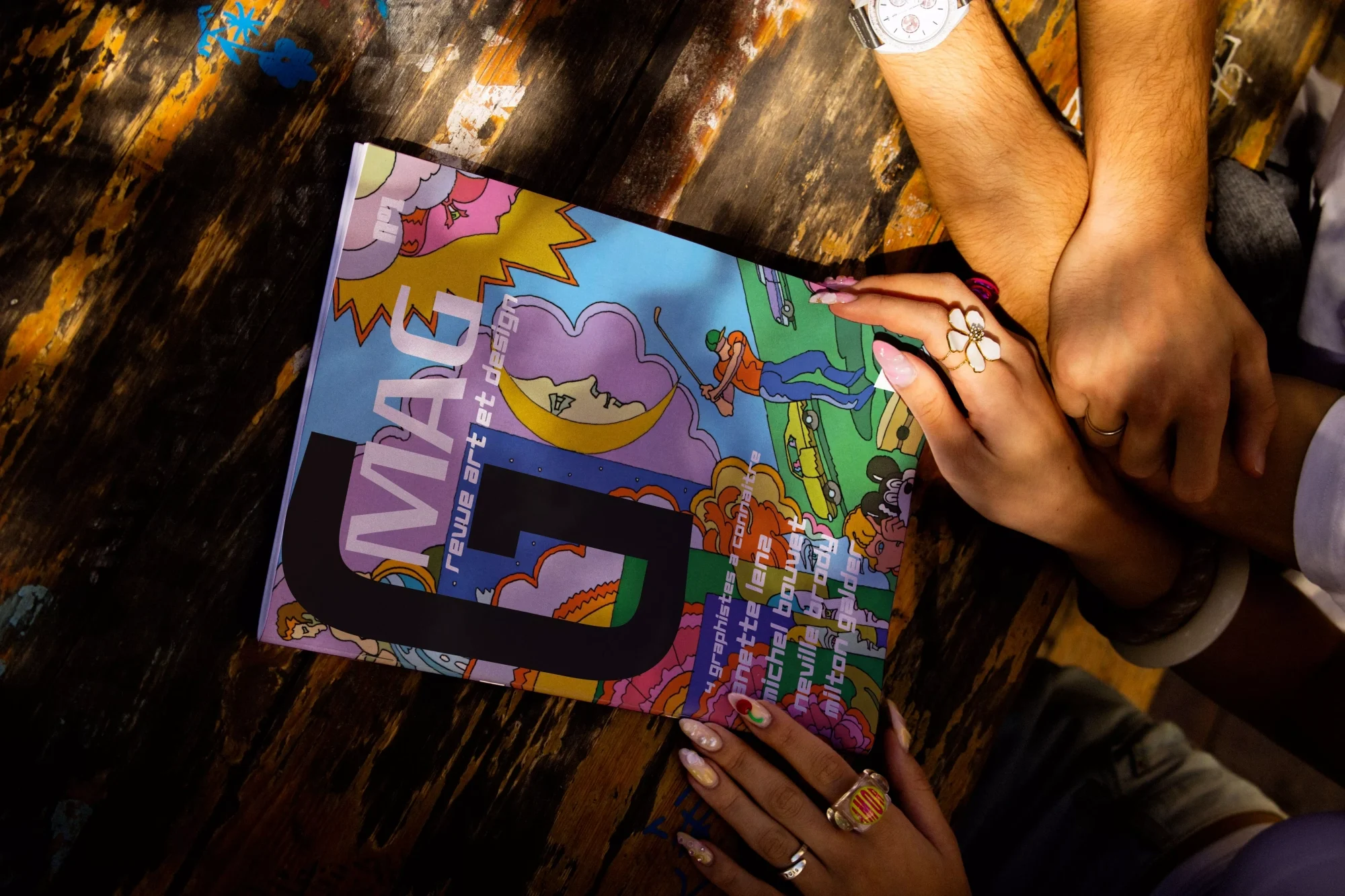
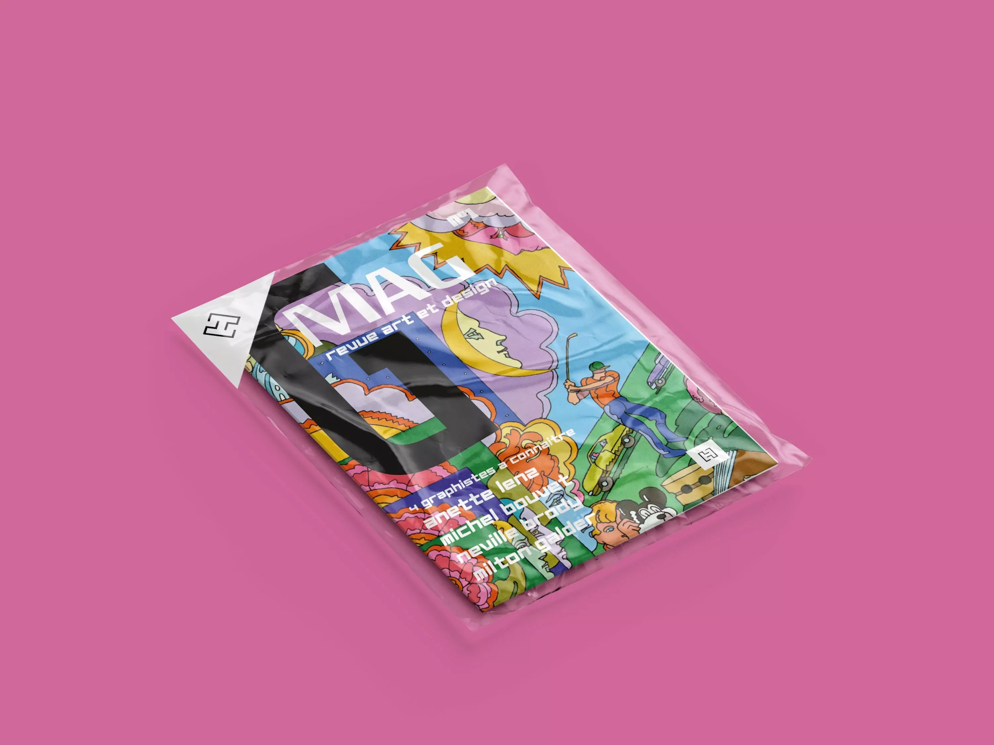
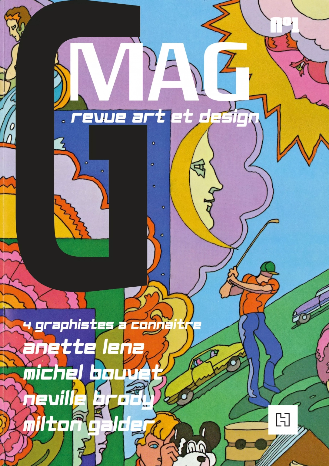
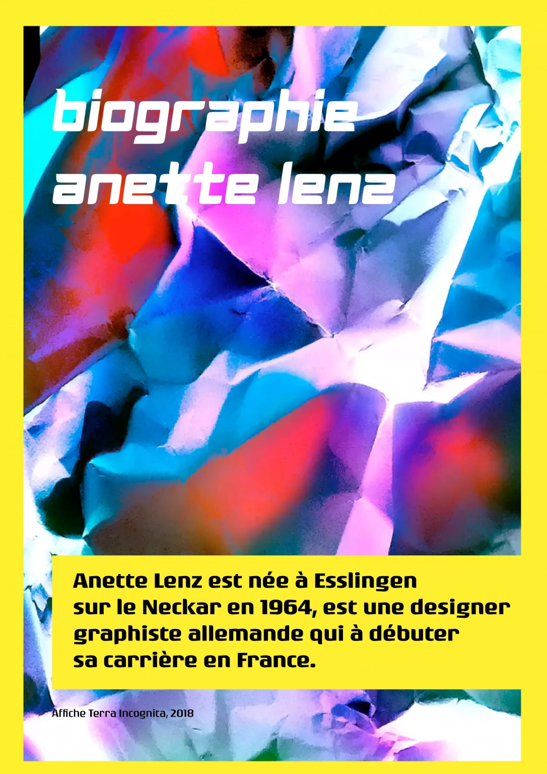
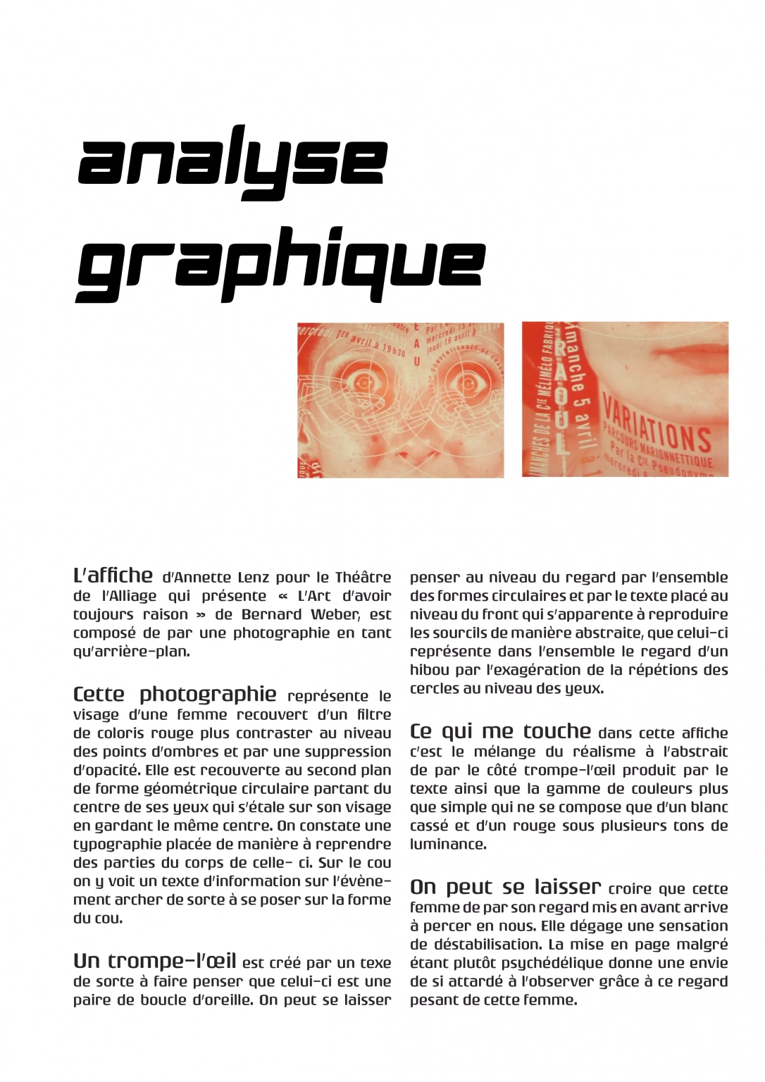
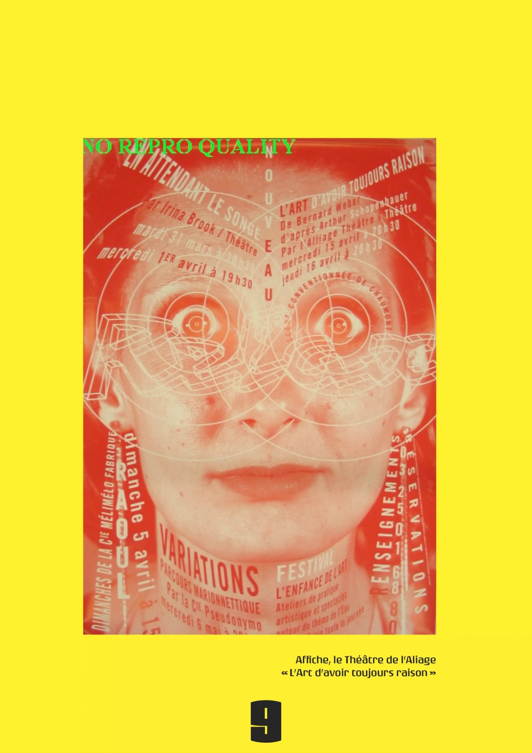
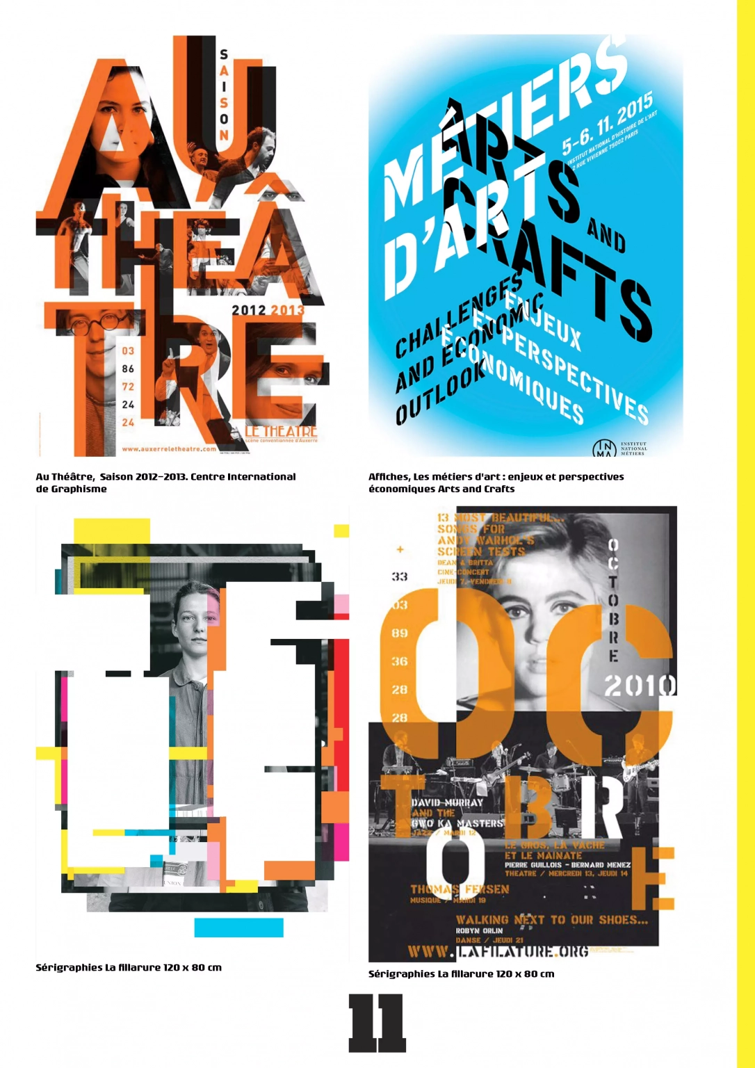
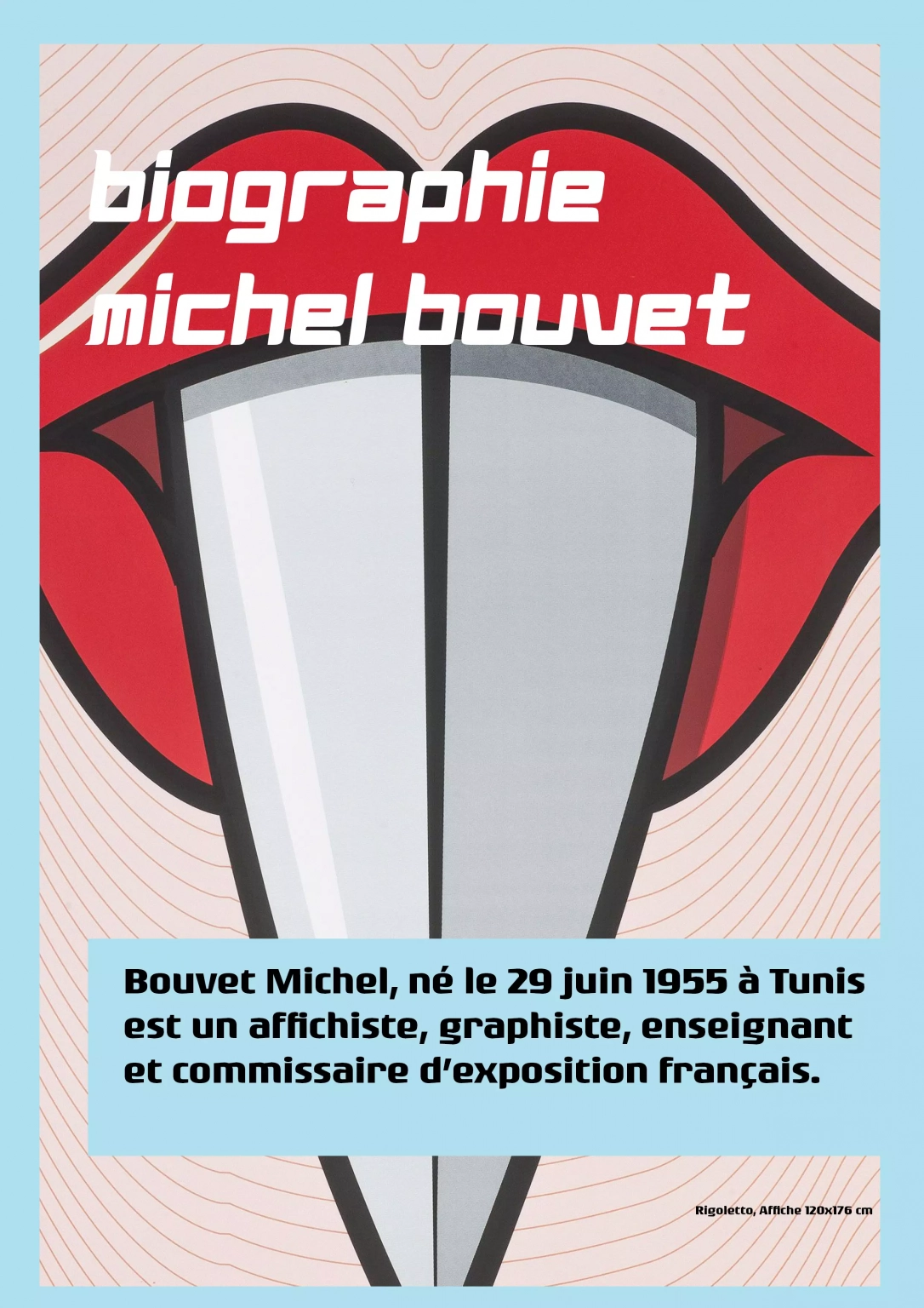
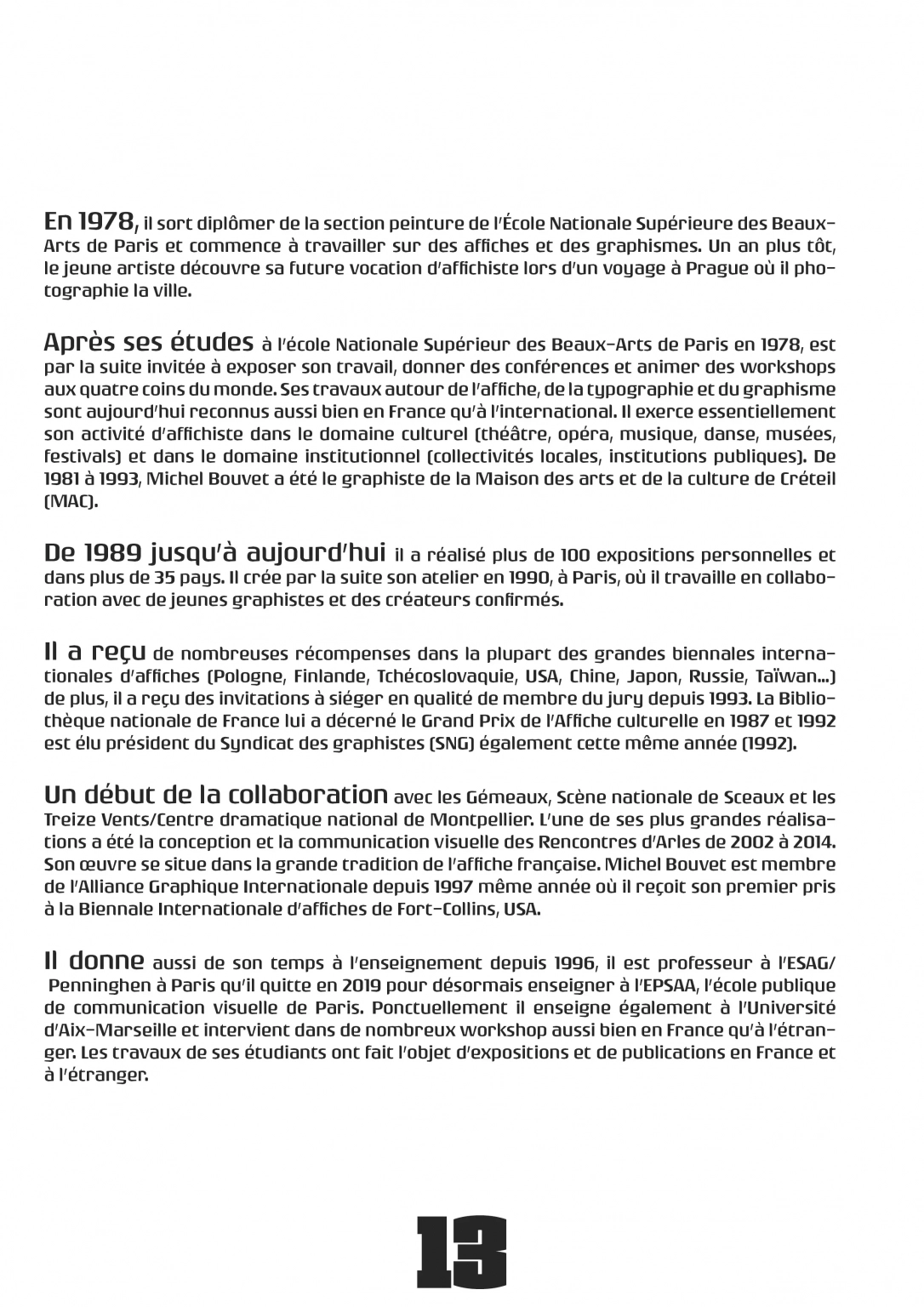
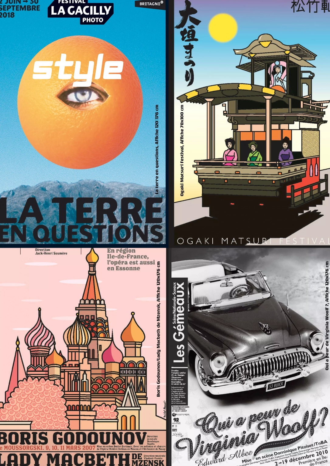
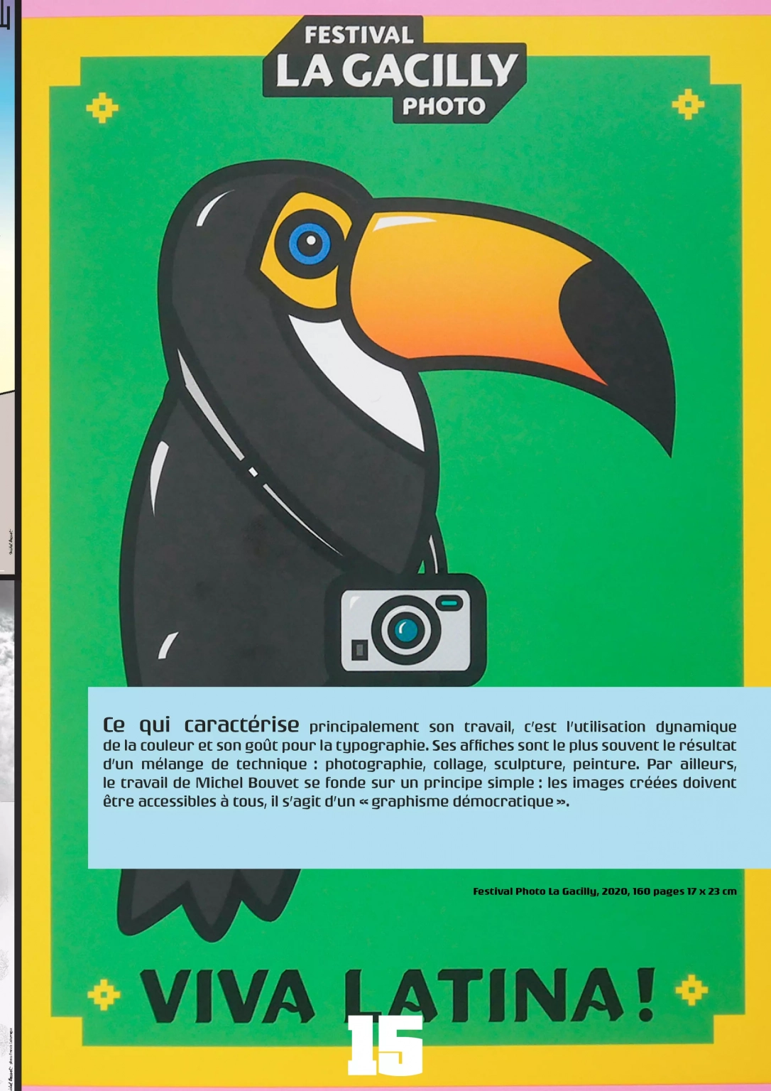
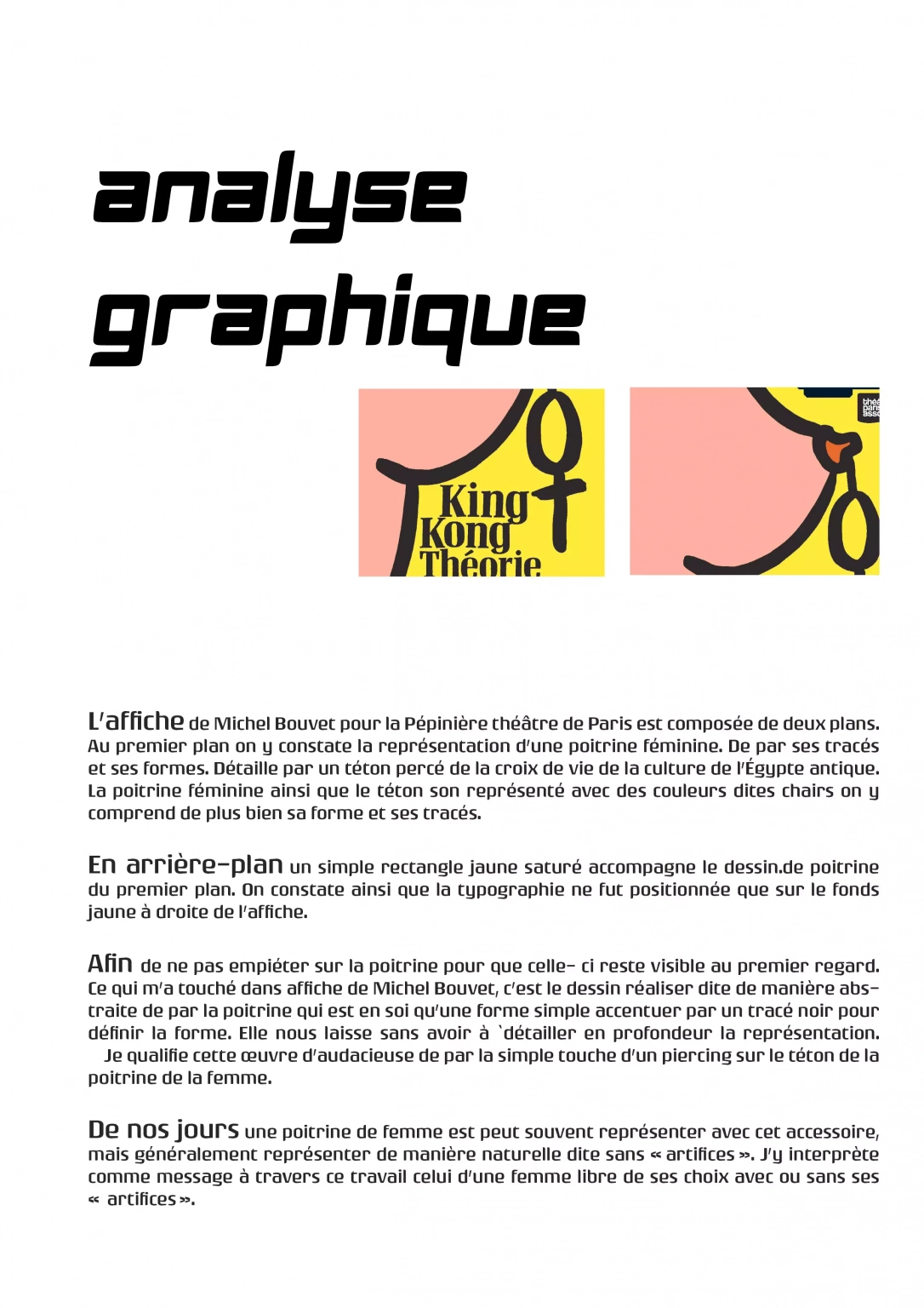
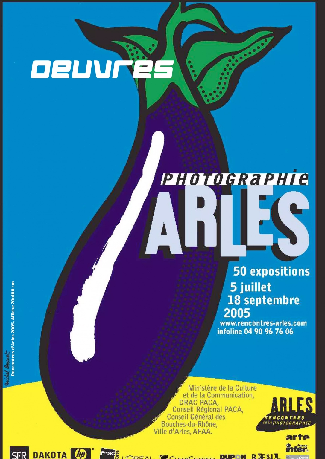
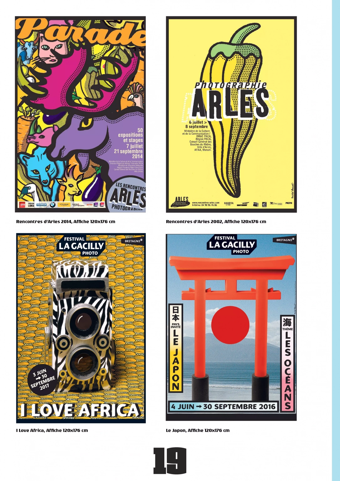
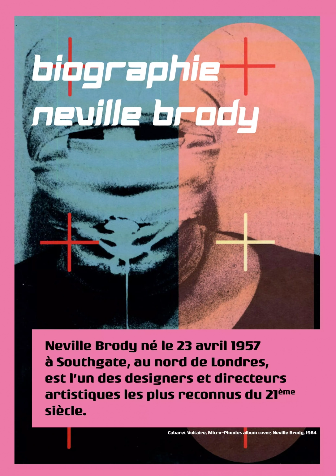
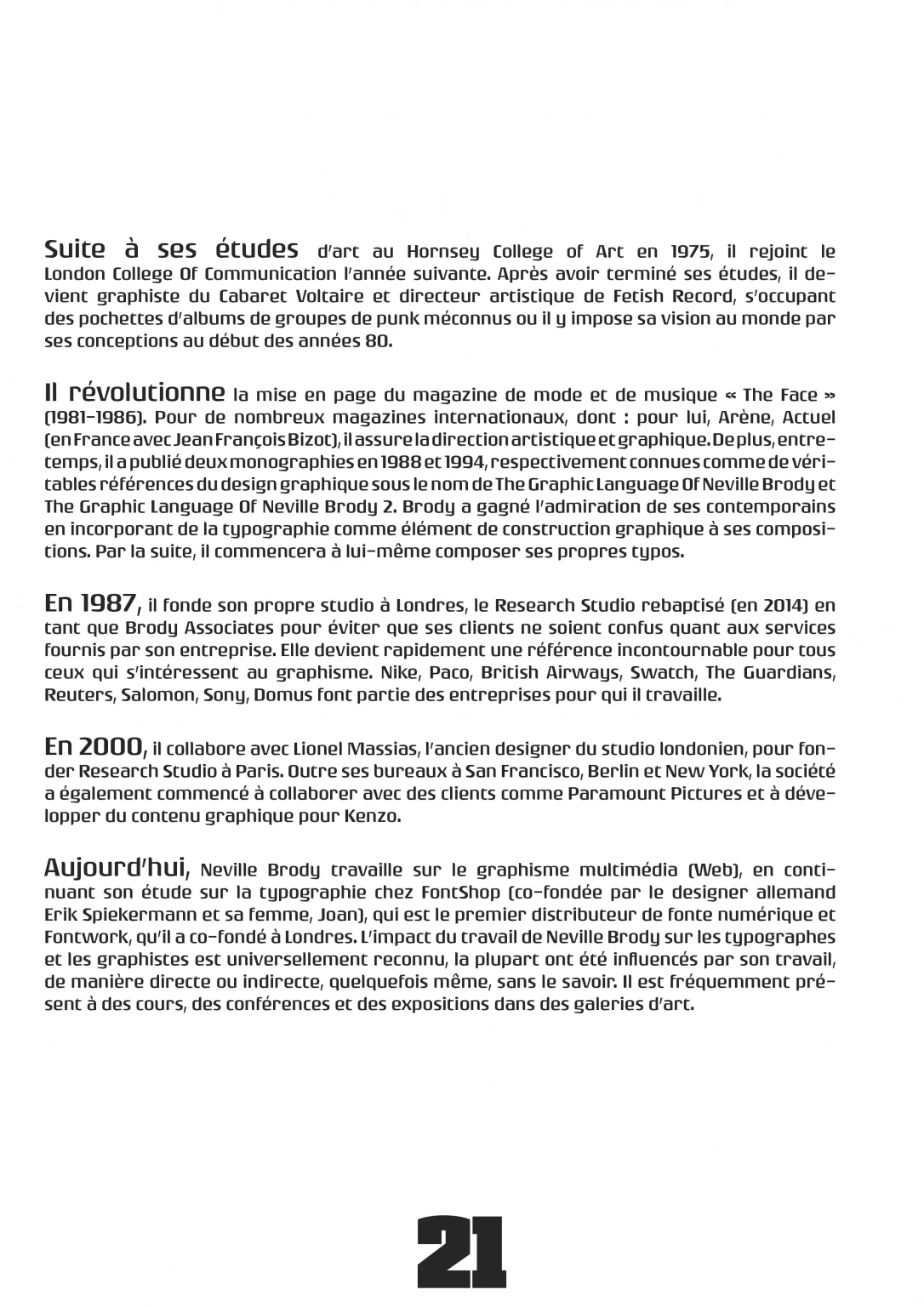
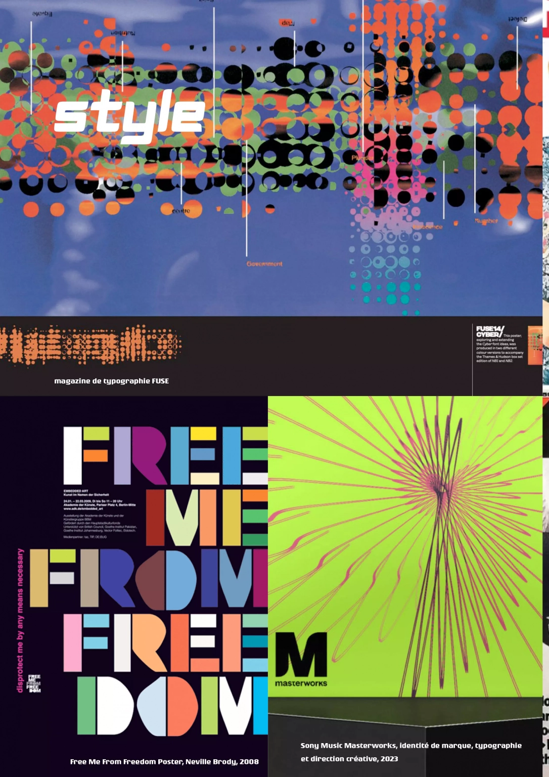
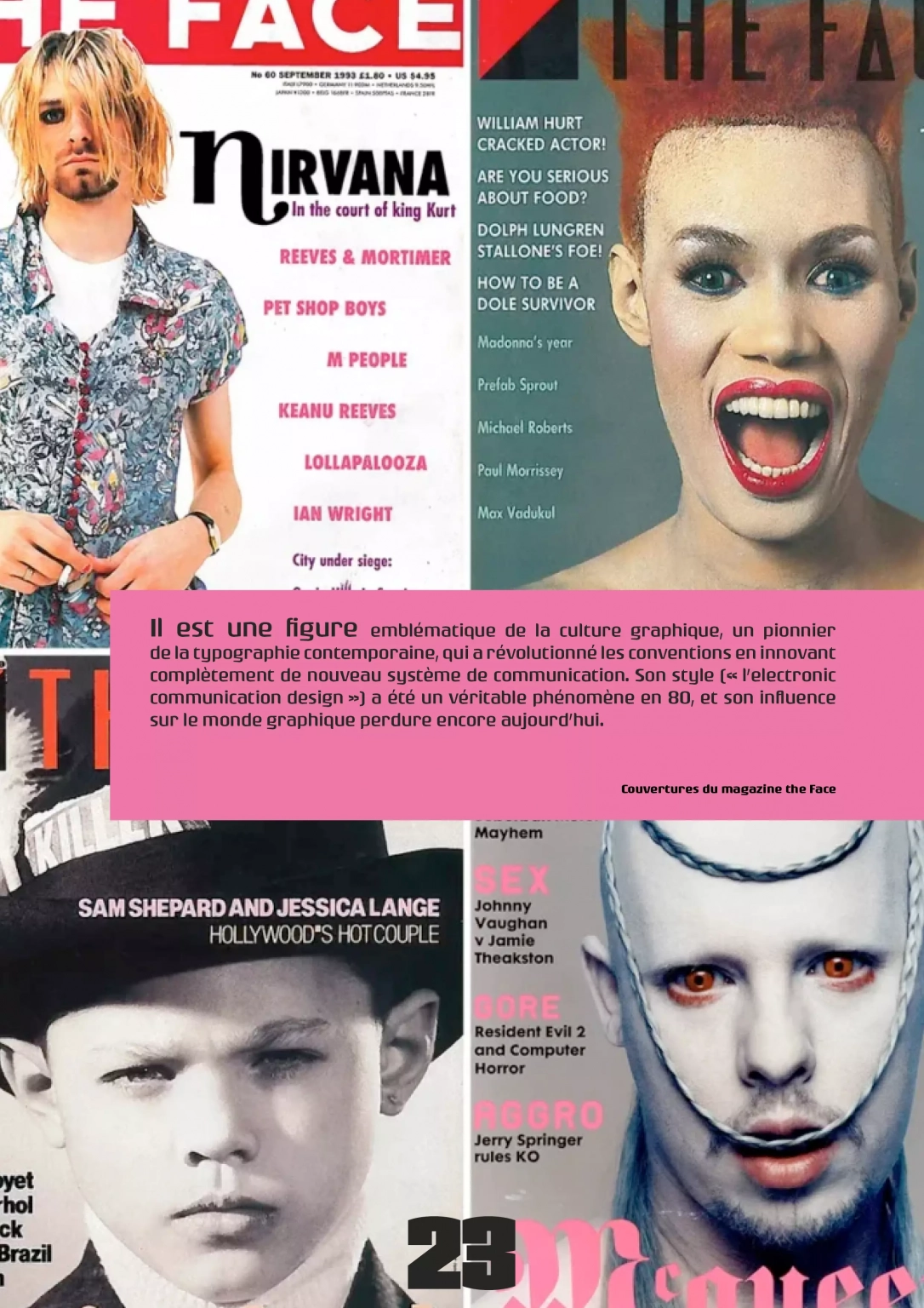
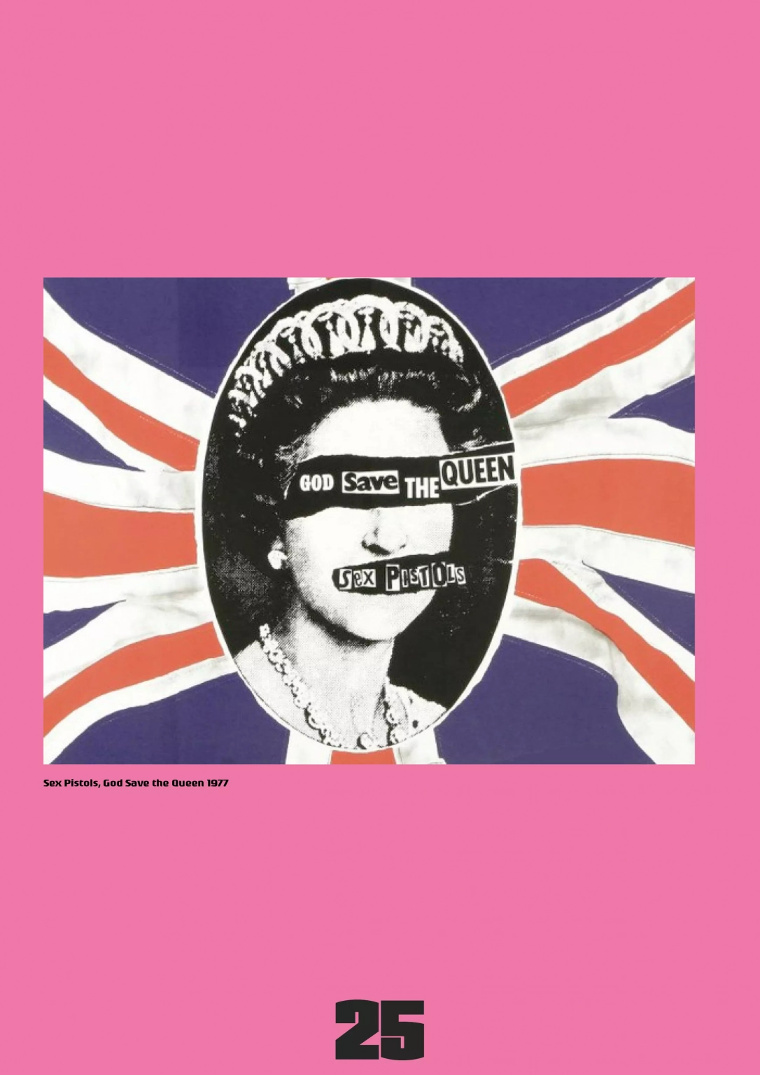
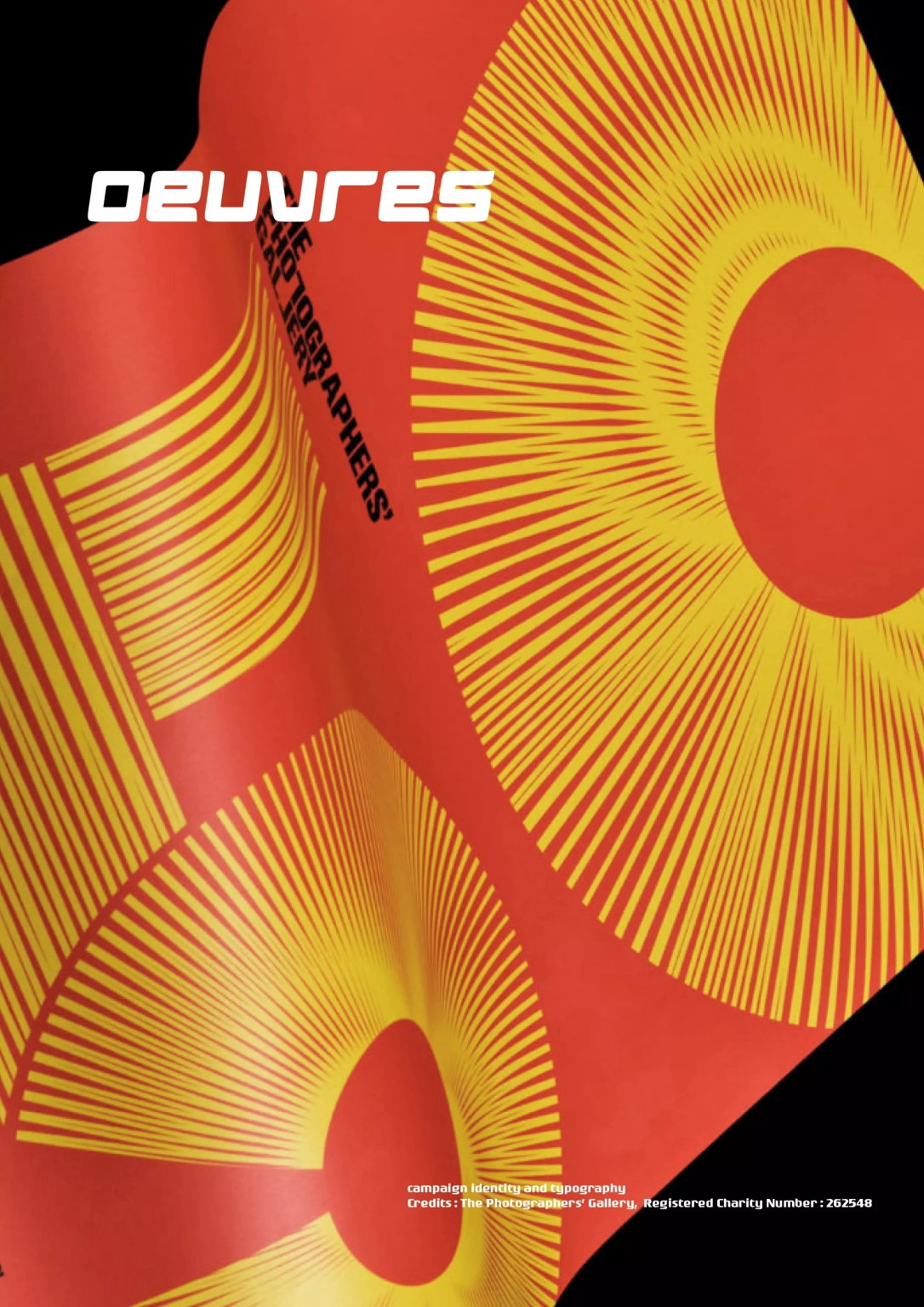
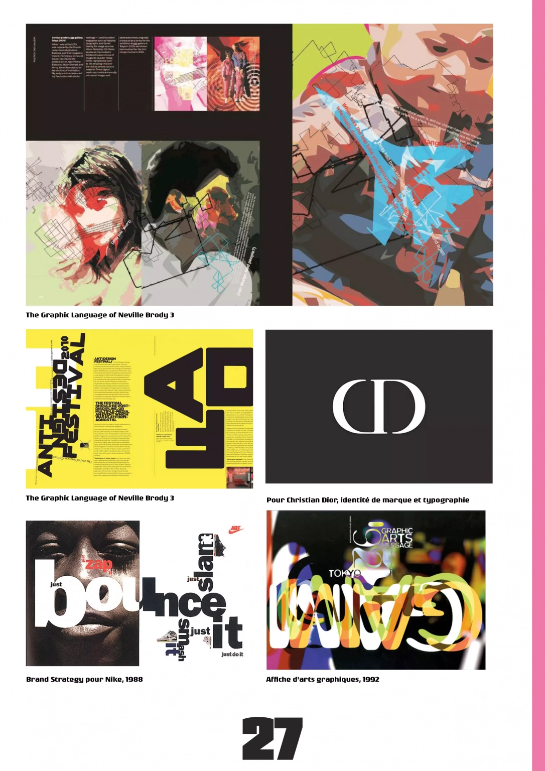
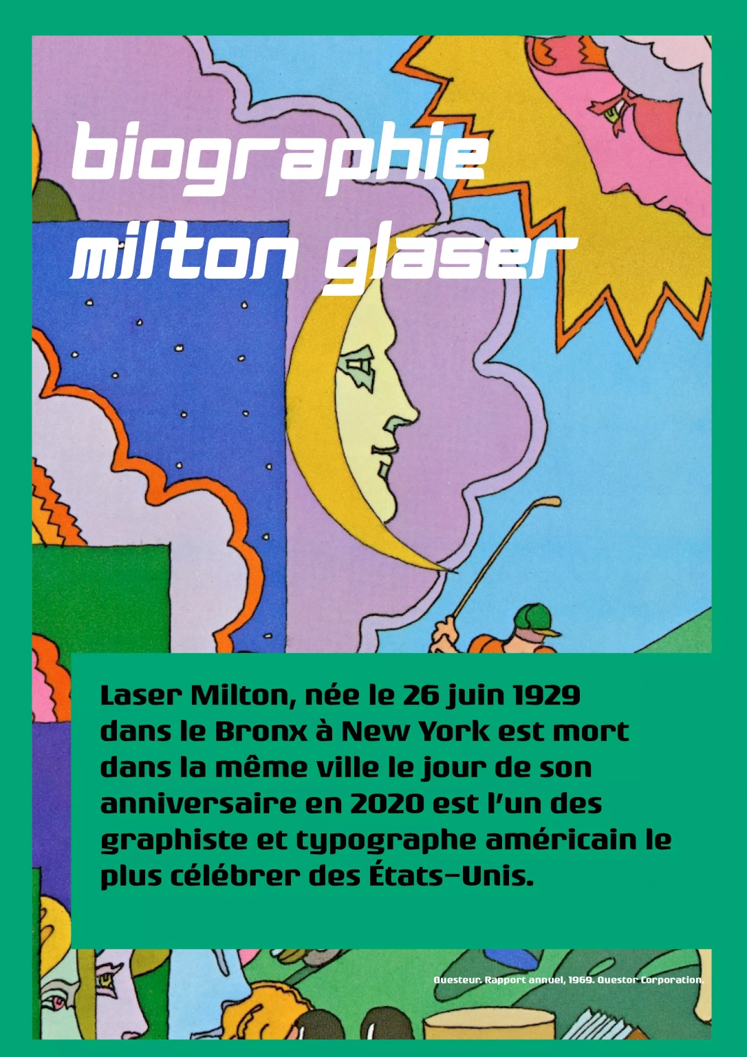
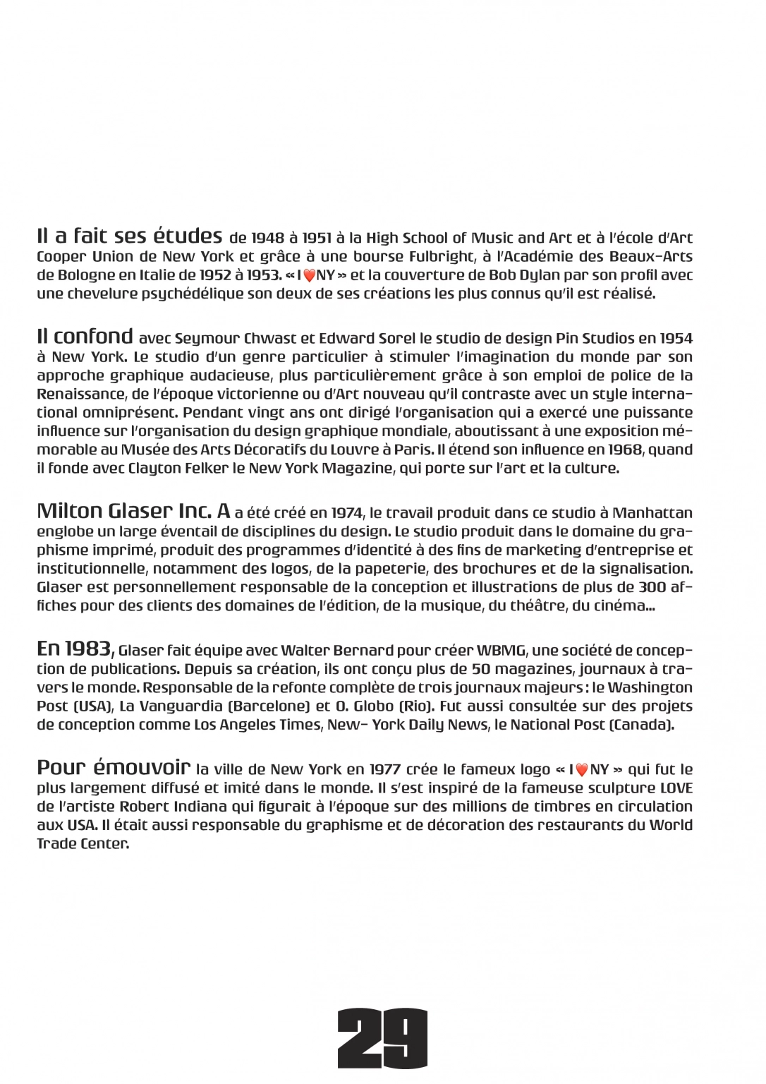
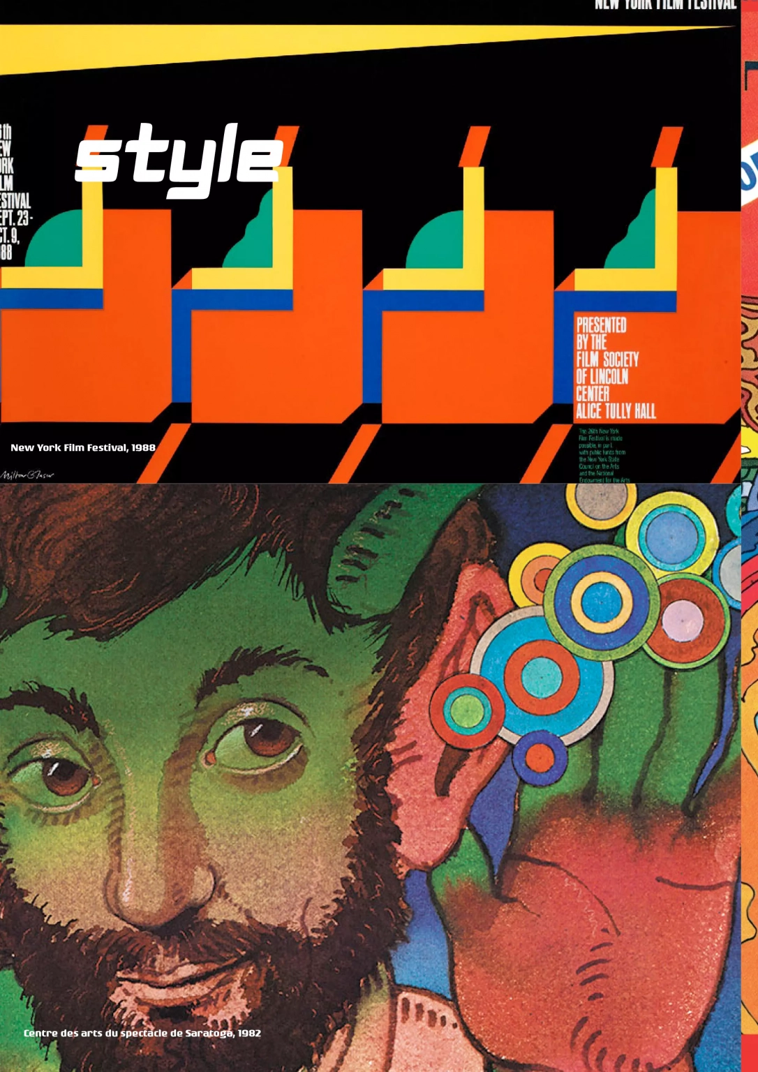
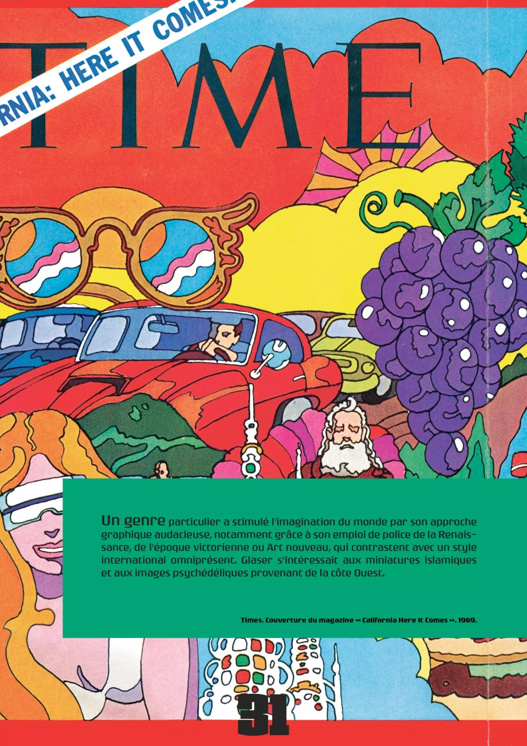
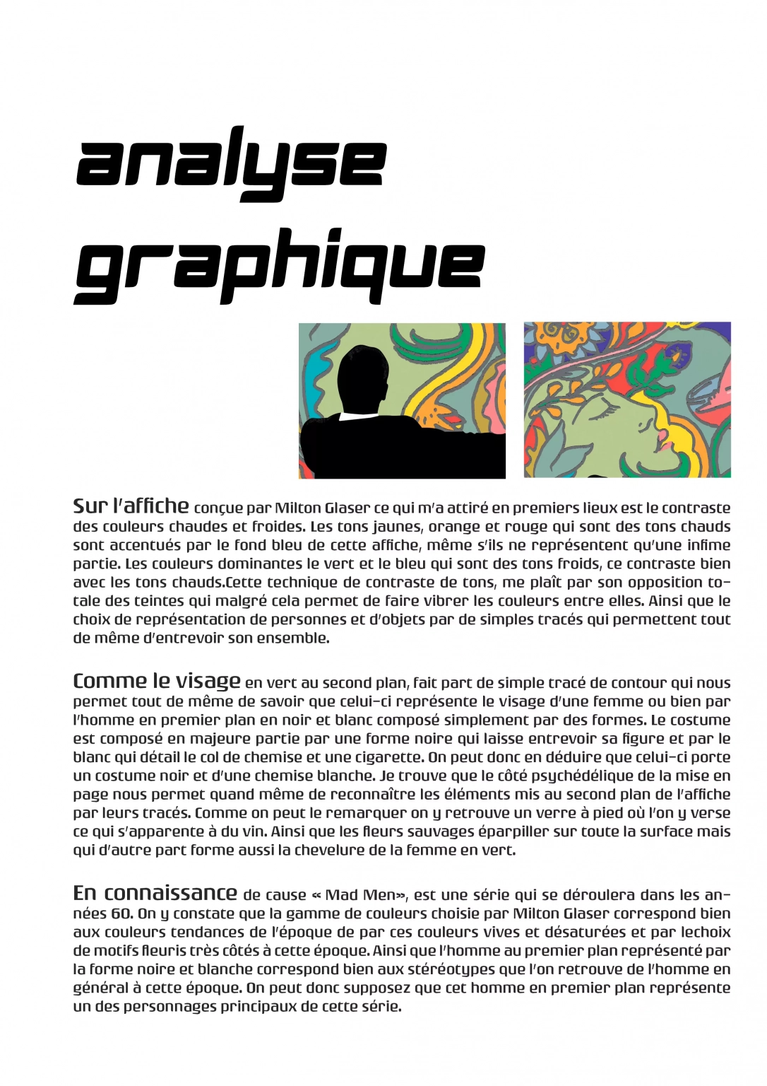
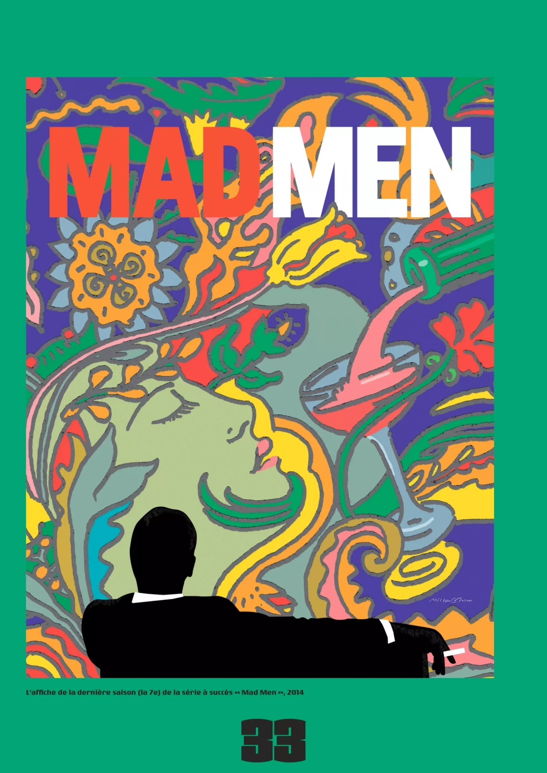
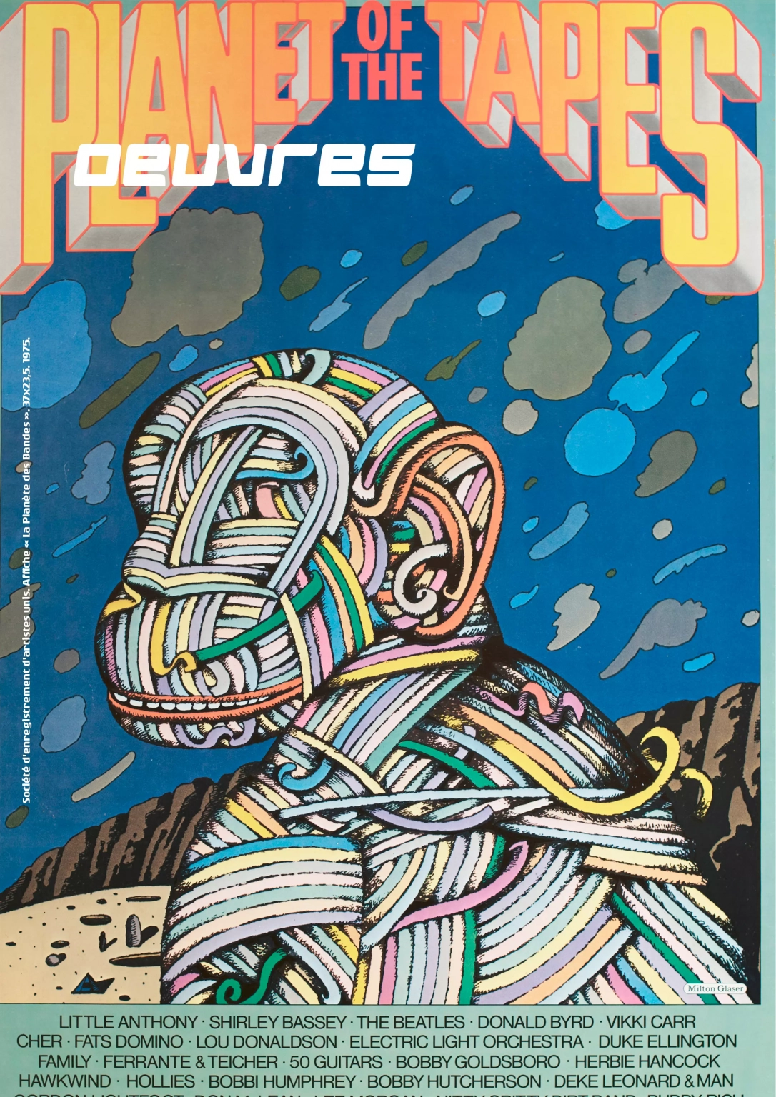
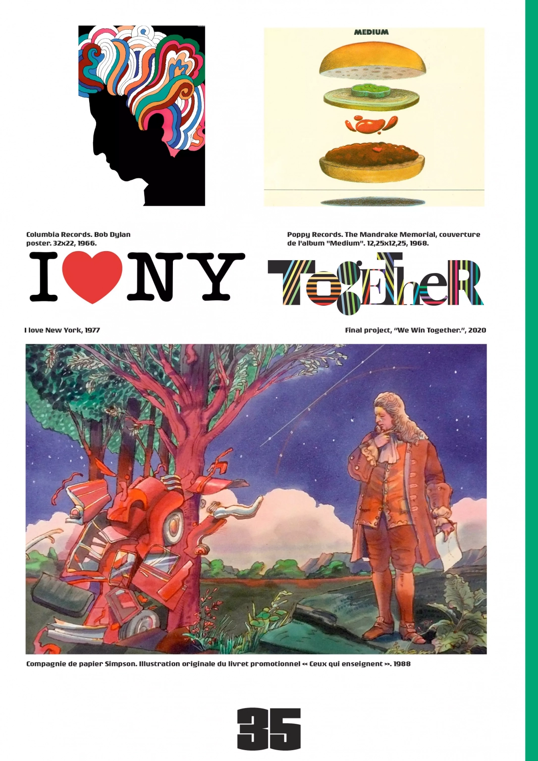
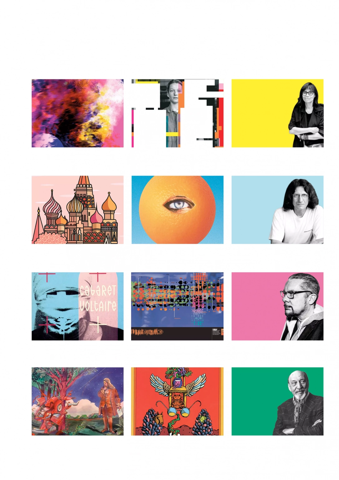
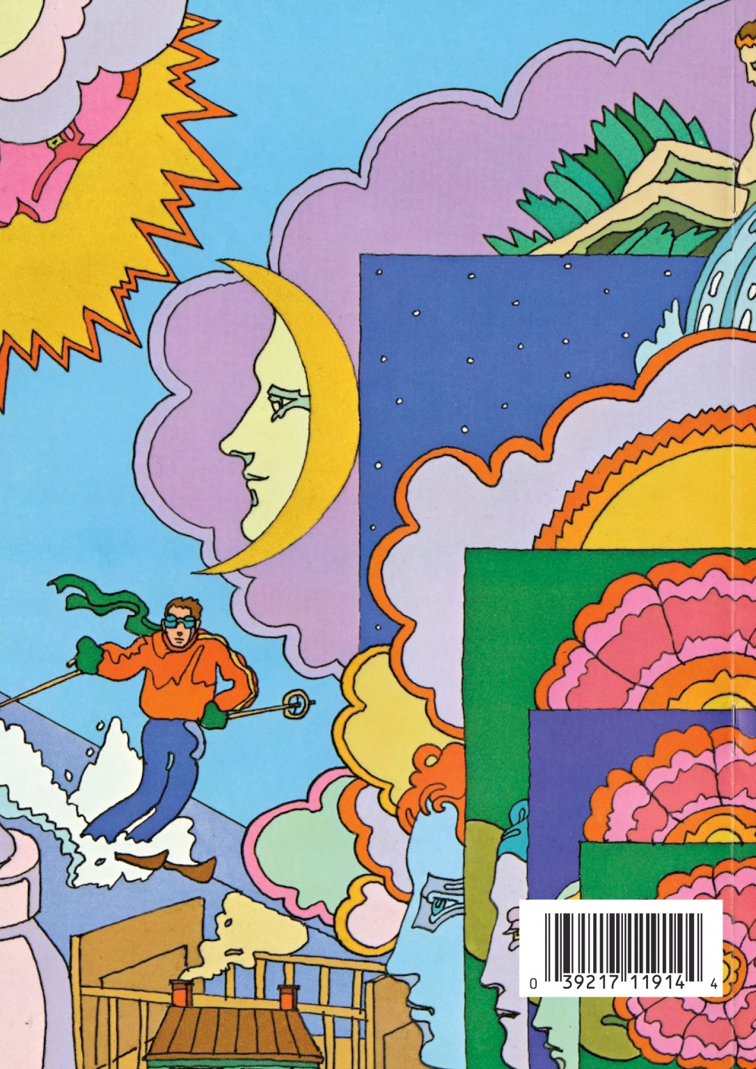
Overall design and editorial layout of an art and design publication for Éditions Hachette. Titled Gmag, this review delivers an in-depth visual analysis dedicated to four major figures of contemporary graphic design: Anette Lenz, Neville Brody, Michel Bouvet, and Milton Glaser.
Concept & Experience
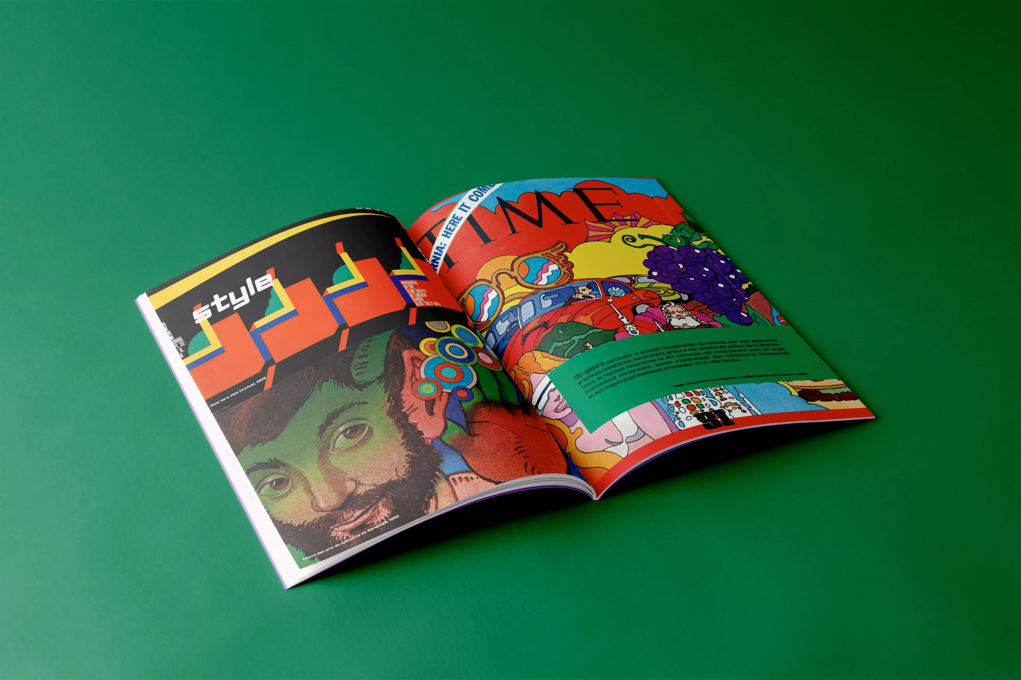
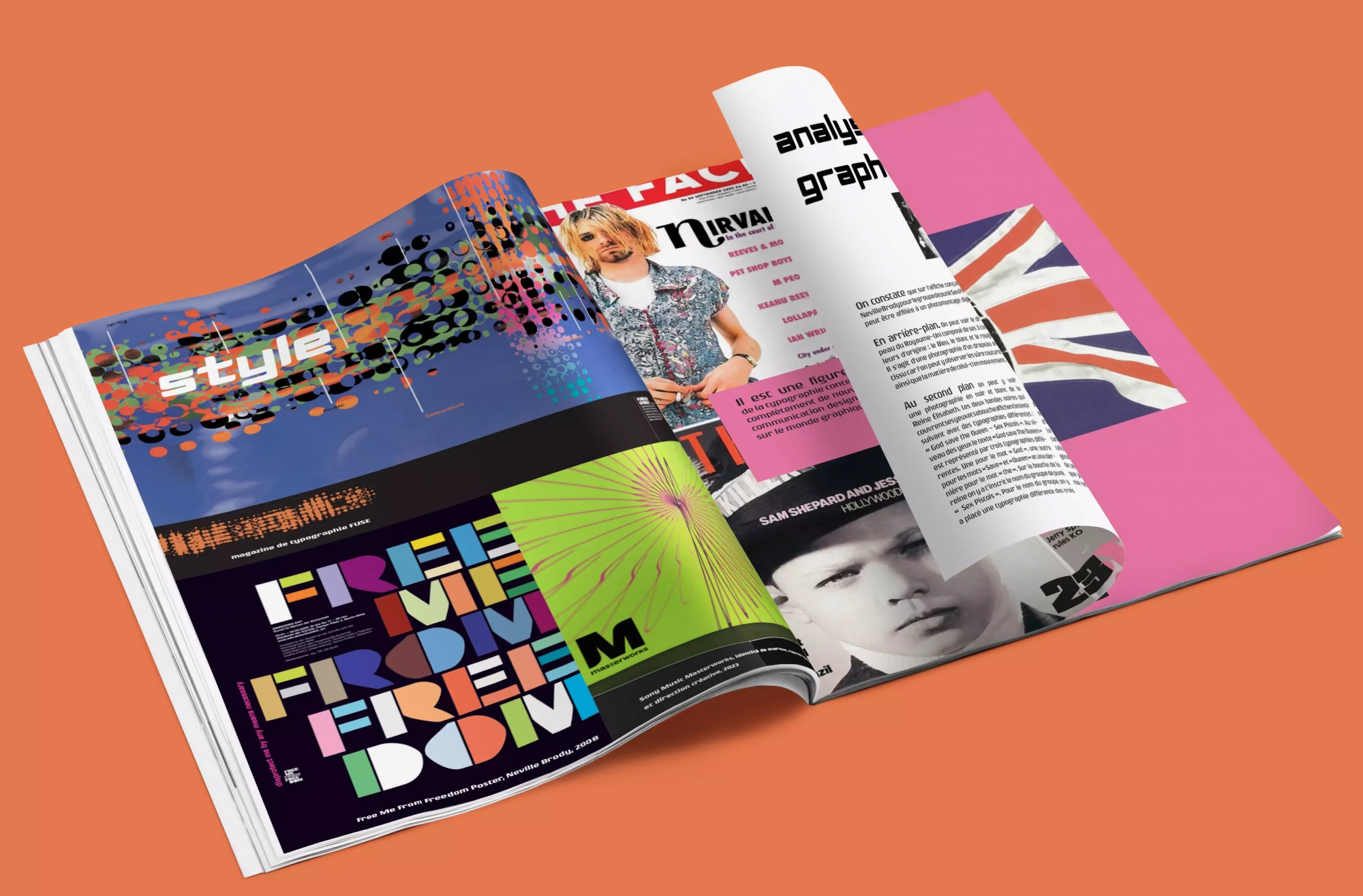
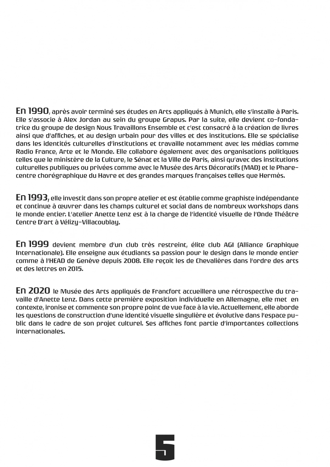
Balancing critical inquiry with engaging pacing defined the editorial mission for this review. In practice, dense documentation spanning biographies, stylistic dissections, and portfolio spreads finds clarity through deliberate typographic hierarchy and breathing room.
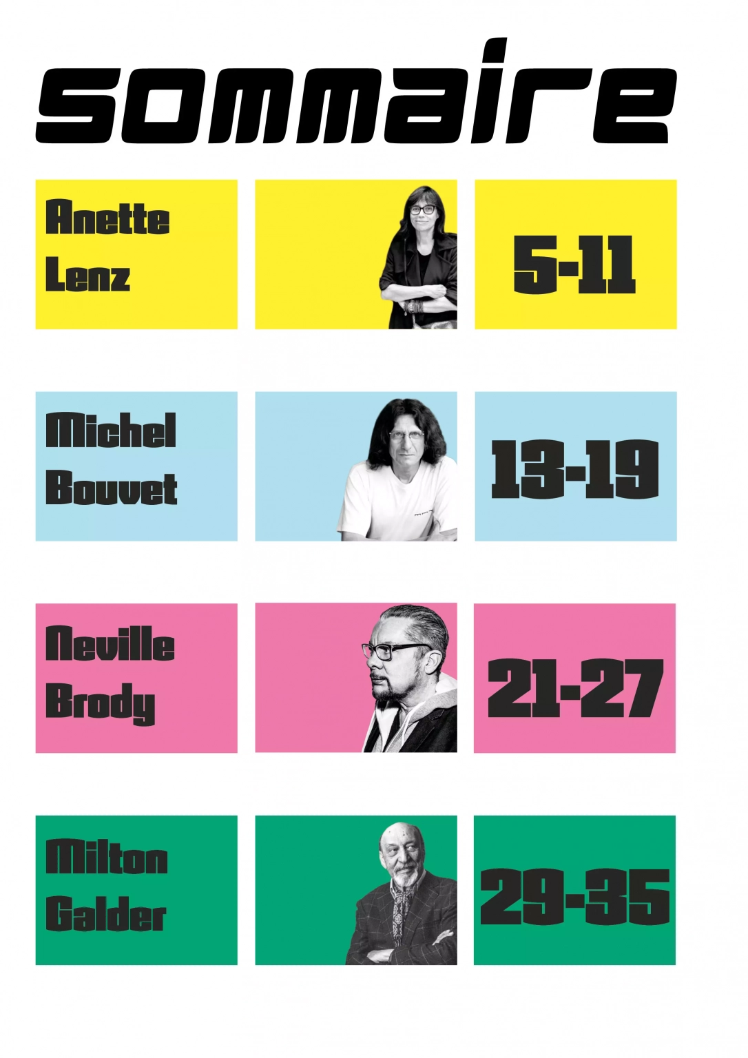
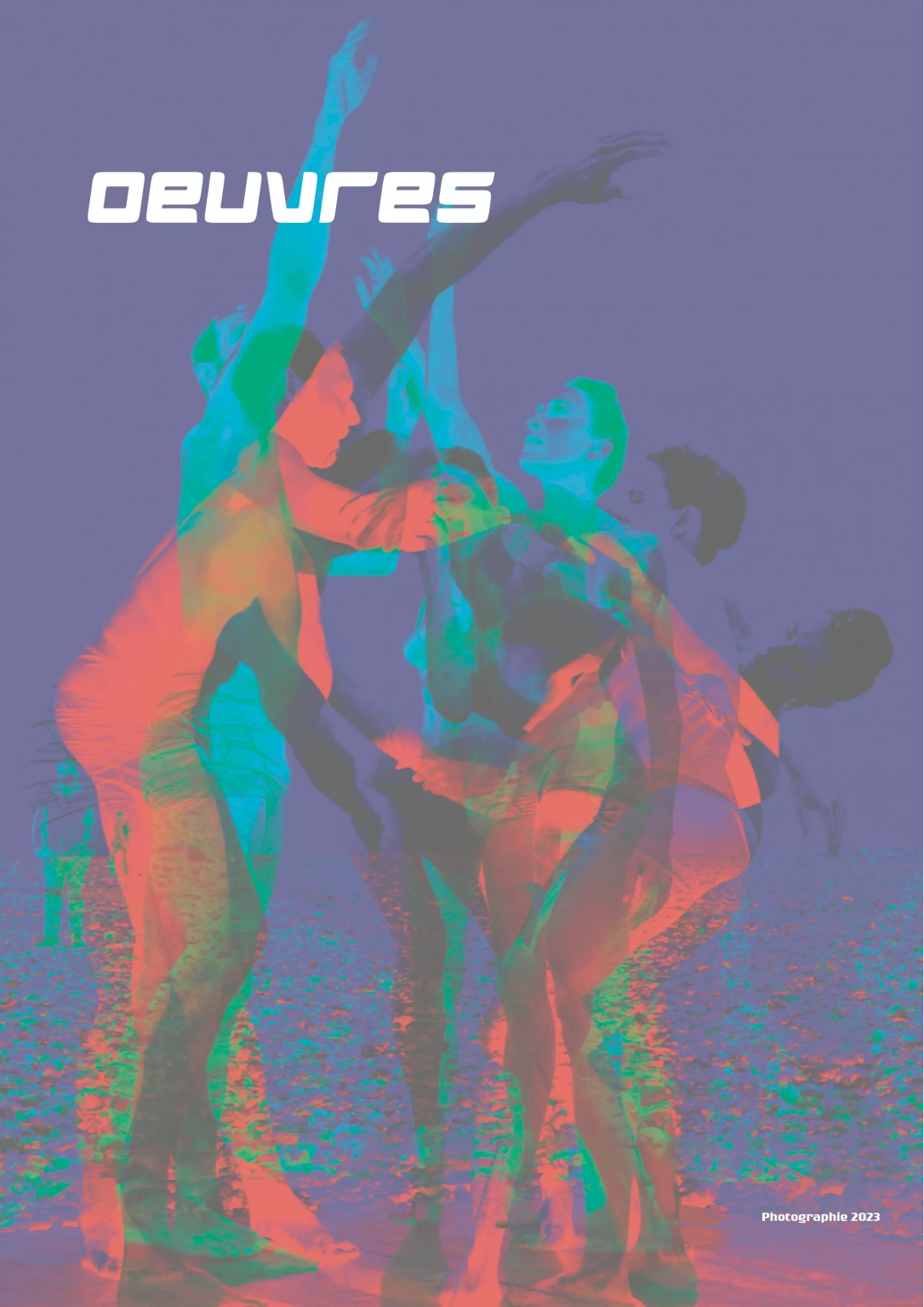
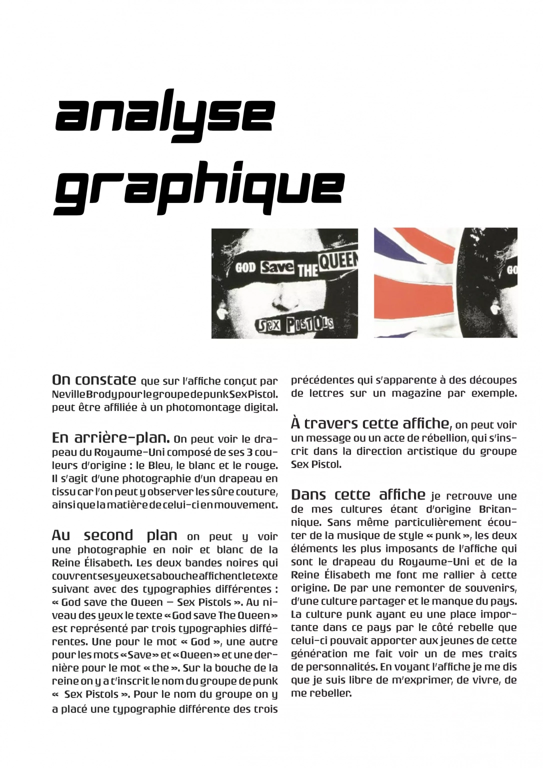
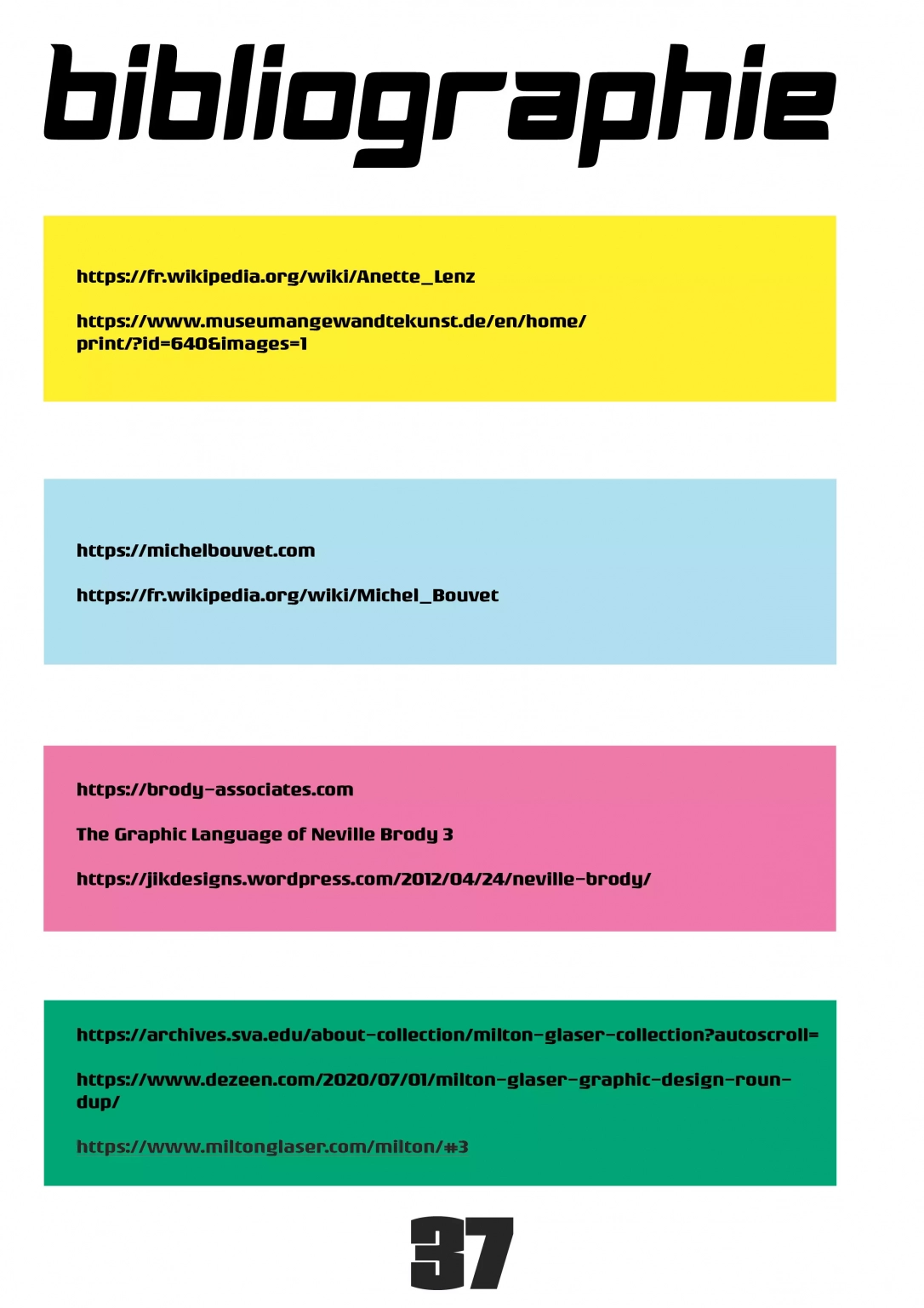
To guide navigation, the reading flow is anchored by a sharp chromatic identity. A distinct signature shade distinguishes each featured designer (lemon yellow, sky blue, emerald green, and fuchsia pink), offering unmistakable visual landmarks throughout the volume. Consequently, this color-led architecture celebrates the singular formal universe of each figure without compromising the cohesive framework of the magazine.
Creative Process
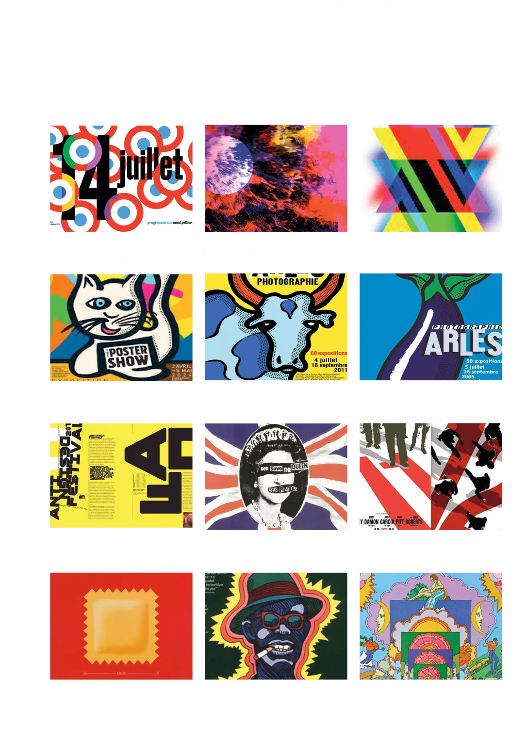
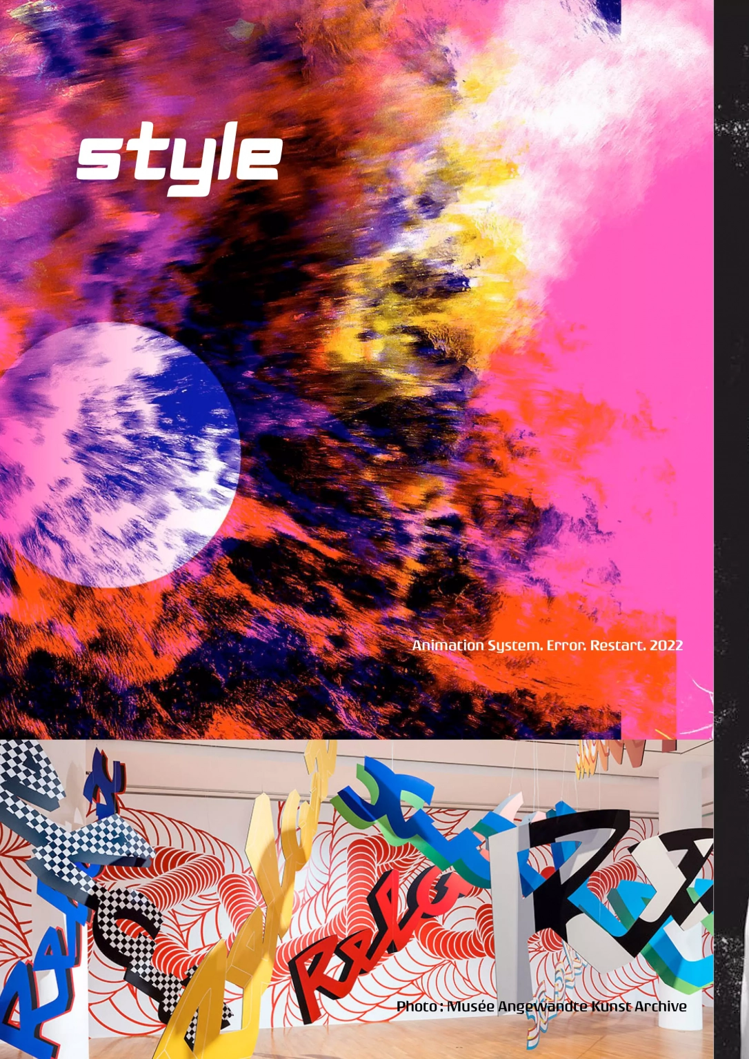
Developing a versatile modular grid formed the core challenge, requiring a system capable of accommodating divergent design philosophies—from Neville Brody’s post-punk experimentation and Michel Bouvet’s expressive theatricality to Anette Lenz’s narrative functionalism.
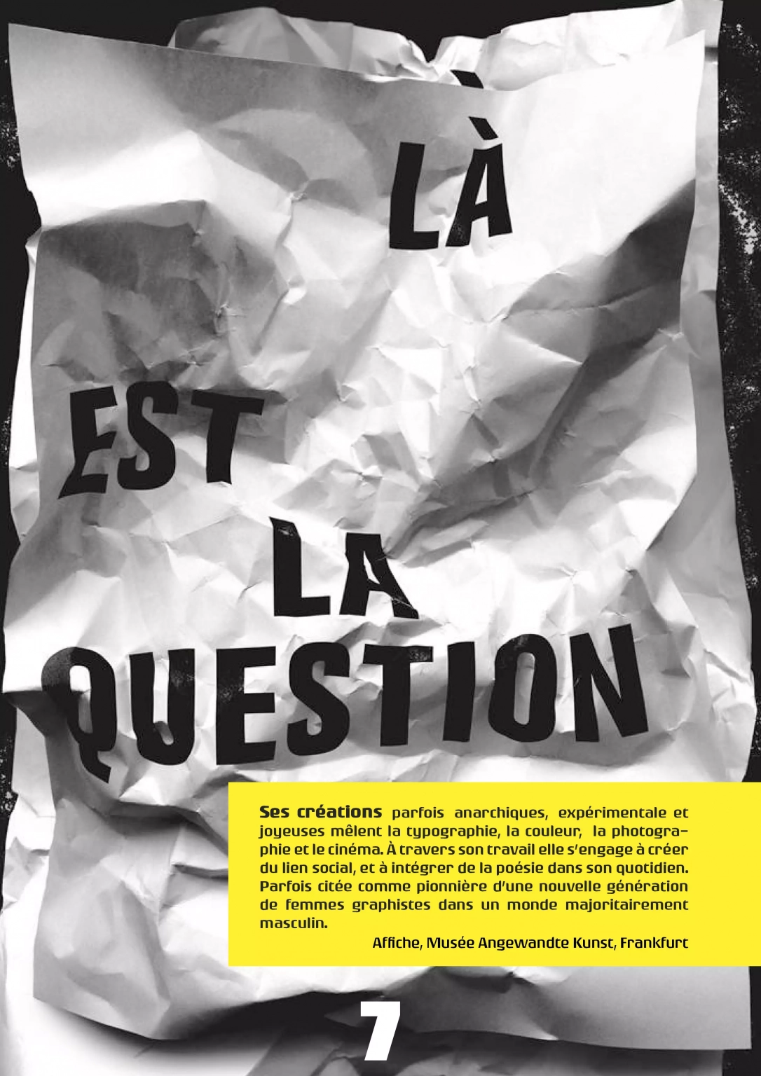
To support this breadth, radical typographic contrasts establish strong visual hierarchy across every spread. The raw, imposing presence of Armanda and Mags commands the display headers with high graphic tension. Meanwhile, the structured neutrality of Rogue guarantees effortless legibility throughout dense analytical columns and running body text.
Consequently, this calibrated type pairing intuitively guides the reader’s eye across layered content, turning each editorial spread into a disciplined yet modern pedagogical tool.
Nous utilisons des cookies pour vous garantir la meilleure expérience sur notre site web. Si vous continuez à utiliser ce site, nous supposerons que vous en êtes satisfait.