Valentine’s Day Limited Edition: An interactive pop-up box.
About
For Scoop Me a Cookie, design of an interactive gift box featuring an engineered pop-up mechanism to spotlight the recipe signature “Tartine-moi plus fort”.
Concept & experience
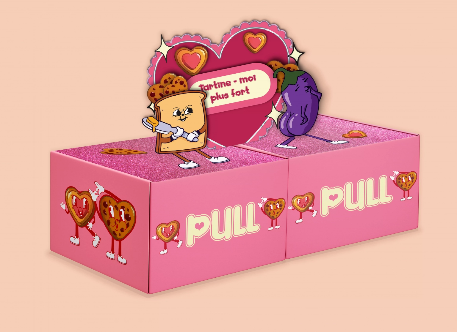
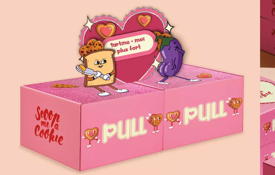
Created for Scoop Me a Cookie’s Valentine’s Day campaign, this limited-edition packaging highlights the playfully named “Tartine-moi plus fort” cookie. The design features a clamshell gift box with dual compartments, creating an interactive treat meant to be shared.
Opening the box instantly reveals an illustrated pop-up mechanism. It brings the cheeky product name to life through a humorous, suggestive scene that reflects the brand’s playful identity. At the same time, heart-shaped cookies frame the centerpiece, seamlessly blending the romance narrative with gourmet indulgence.
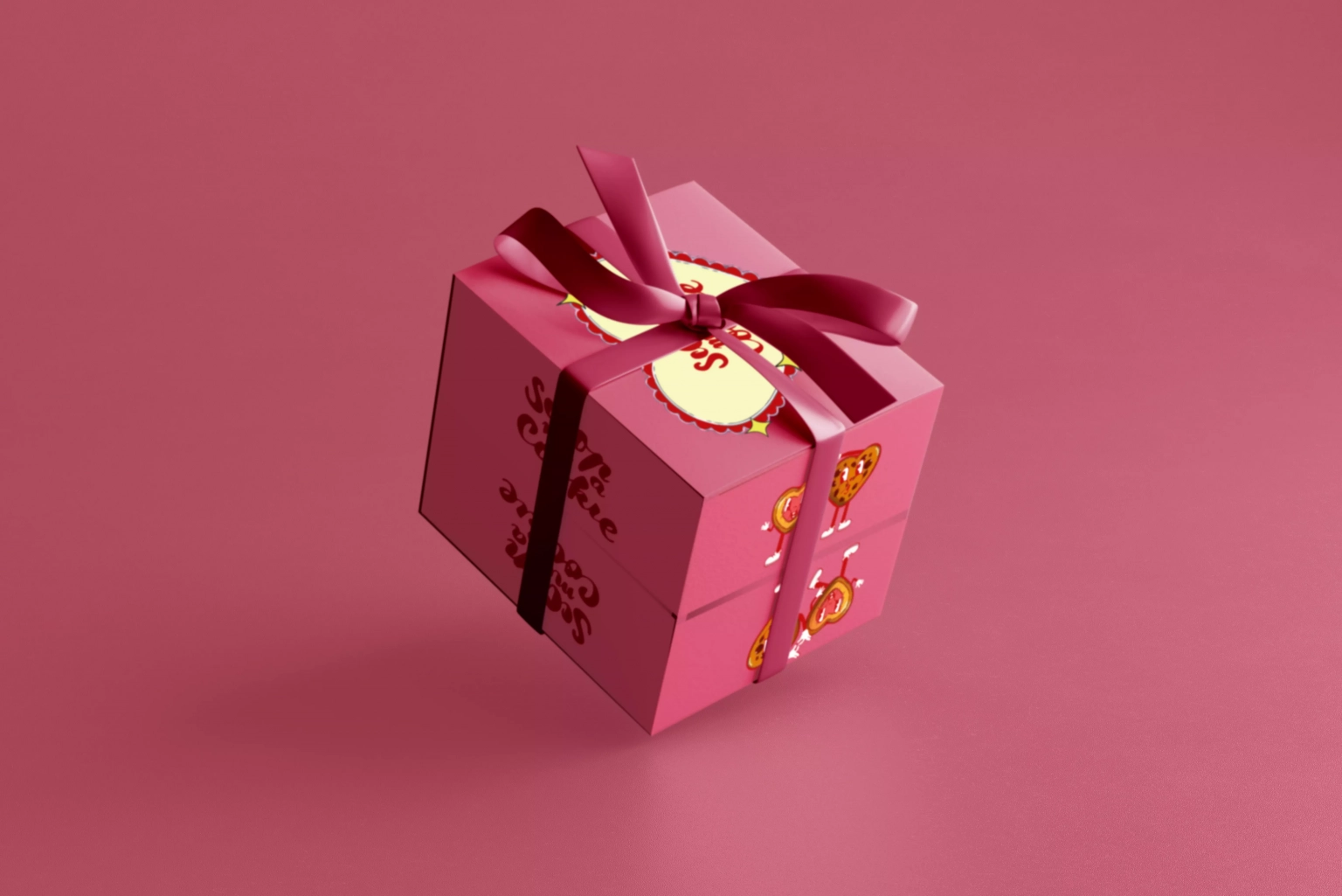
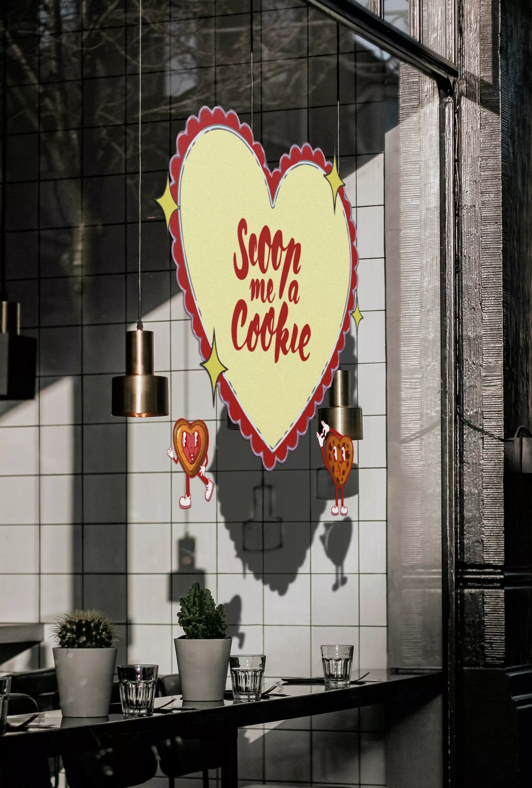
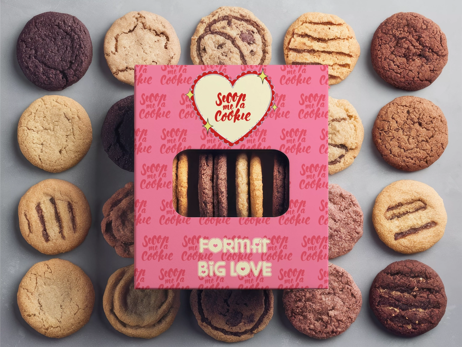
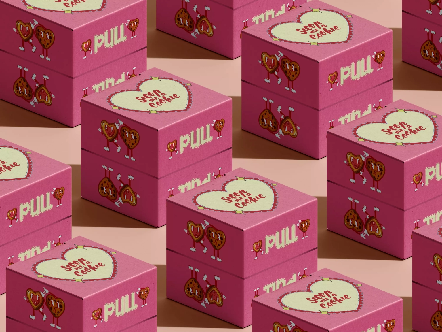
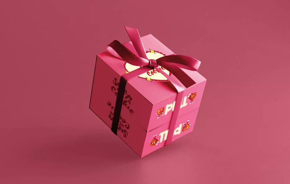
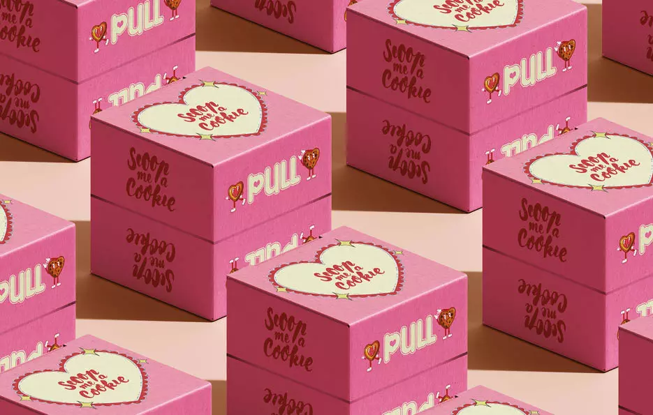
The exterior contrasts this playful interior with a sleek monochrome surface that honors the brand’s core palette. Furthermore, the top panel integrates the updated logo with a customized heart icon. A distinct “PULL” callout on the front flap guides the user intuitively toward the opening motion.
Illustrated cookie characters wrap around the side panels to maintain visual continuity from every angle. Similarly, the back panel turns the ingredient list into an illustrated feature to ensure total graphic consistency. To complete the presentation, a gift ribbon secures the structure, keeping the pop-up surprise intact until the final reveal.
Creative Process
Striking a balance between industrial feasibility and visual storytelling formed the creative intent behind this project. Initially, the process began with a thorough dive into the brand’s DNA, confectionery design codes, and contemporary pop references.
To move beyond conventional carton packaging, development centered heavily on paper engineering. Specifically, this involved drafting flat technical die-cuts, calculating precise fold dynamics, and physically prototyping the pop-up mechanism.
Meanwhile, custom vector illustrations, expressive typography, and calibrated prepress color management ensured complete harmony between the box’s understated exterior and the vibrant graphic burst revealed upon opening.
Nous utilisons des cookies pour vous garantir la meilleure expérience sur notre site web. Si vous continuez à utiliser ce site, nous supposerons que vous en êtes satisfait.