Branding & Visual Identity: a smart speaker designed for serenity.
About
For the Bwave connected speaker, the project offers a sound and visual haven. This minimalist circular object diffuses soothing waves. Indeed, gentle lights adapt at every moment to « Reset your mind ».
Concept & experience
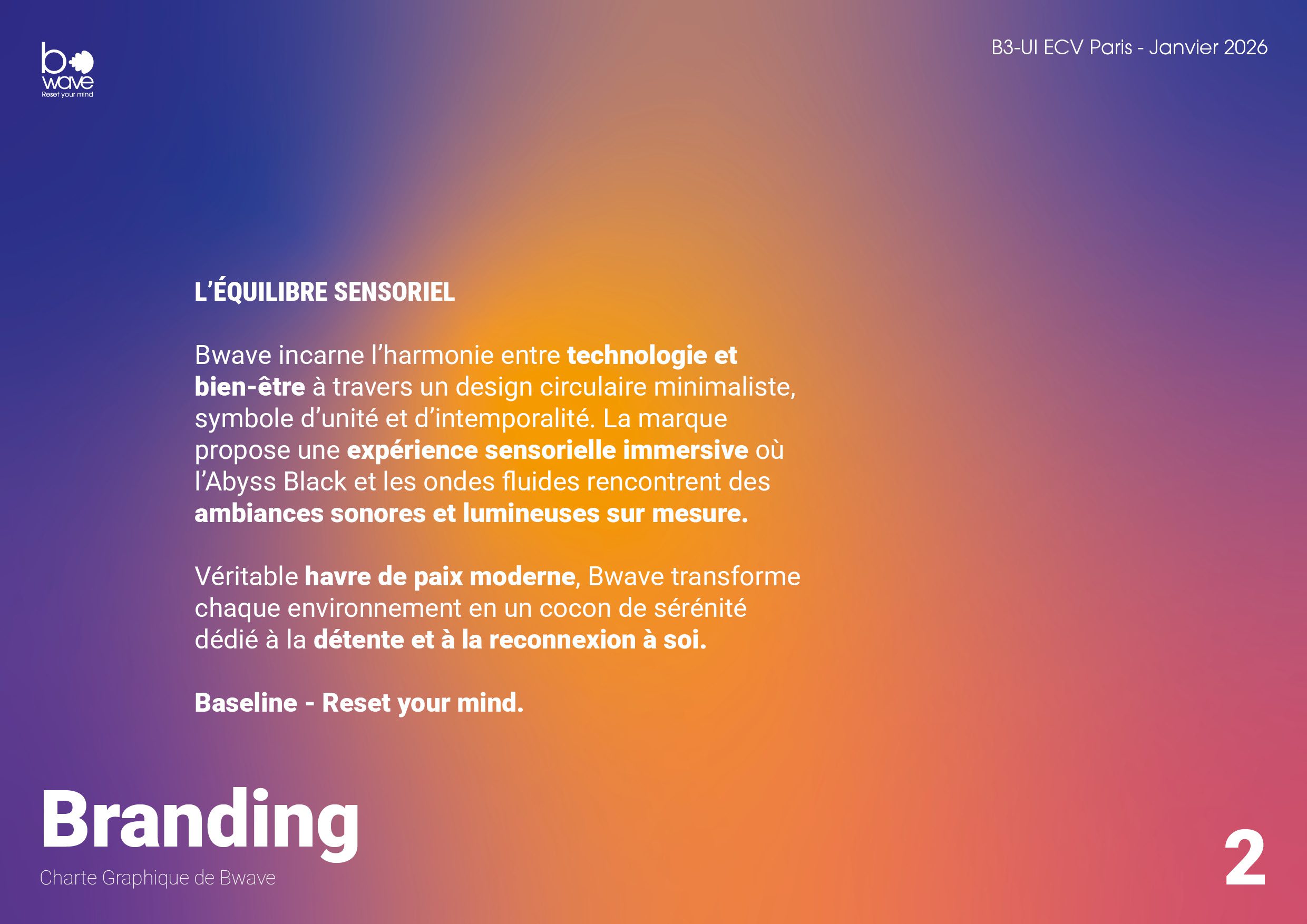
Bwave reimagines our relationship with everyday technology by transforming the smart speaker into a genuine sanctuary for overwhelmed city dwellers and professionals. Designed as a perfect black circle, a symbol of unity, balance, and timelessness, it diffuses soothing sound waves paired with a subtle, evolving light projection that fosters relaxation, deep focus, or sleep. The sensory experience extends beyond simple acoustics: the colorful aura synchronizes with sound flows to adapt the ambiance to the user’s needs.
The immersion builds on a striking contrast between the object’s deep black finish and the vibrant richness of the projected lights, placing innovation at the service of well-being. By combining the purity of contemporary minimalism with the softness of enveloping waves, Bwave brings its “Reset your mind” promise to life: transforming stimulus saturated urban environments into intimate sensory cocoons, where technology fades away to make room for letting go and reconnecting with oneself.
Creative process
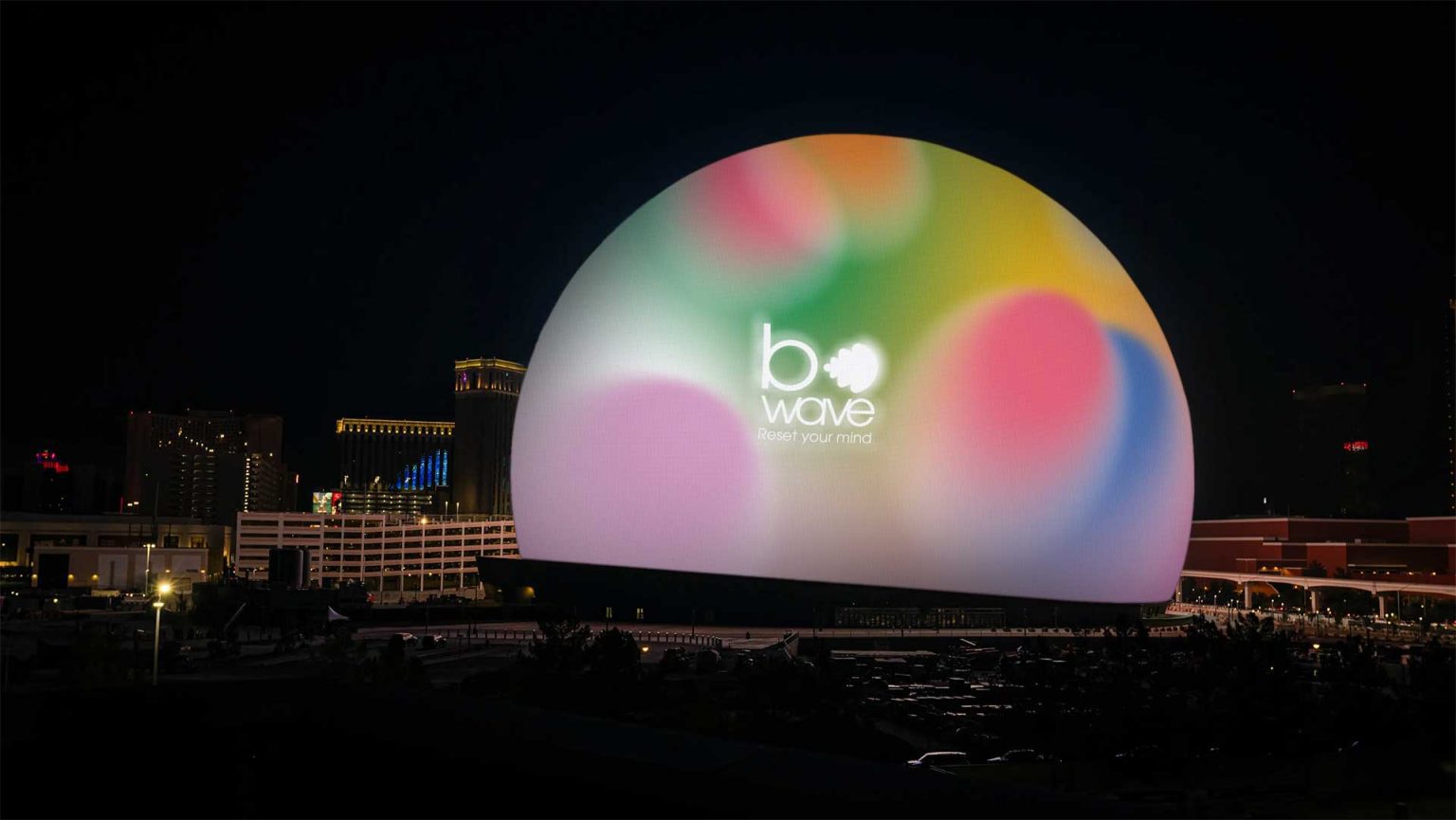
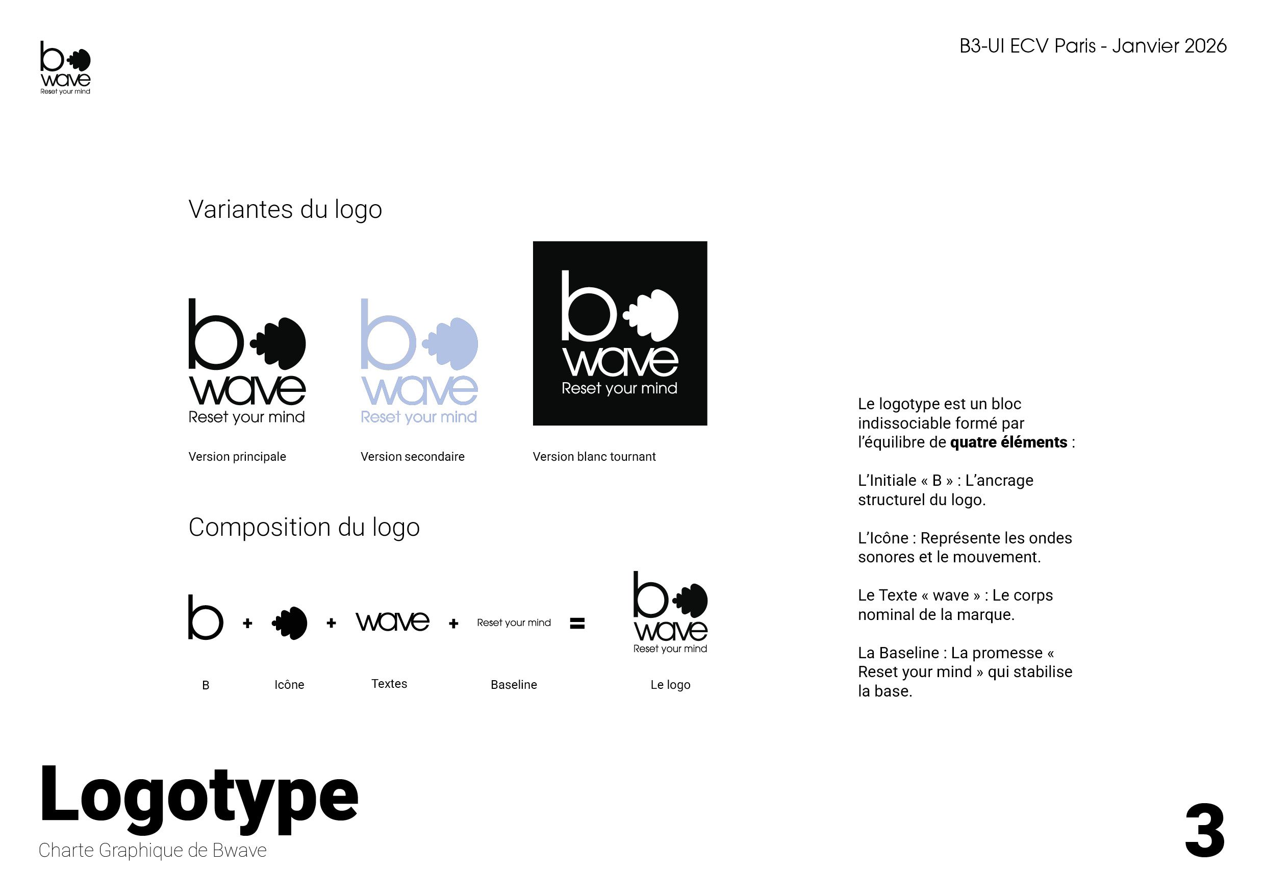
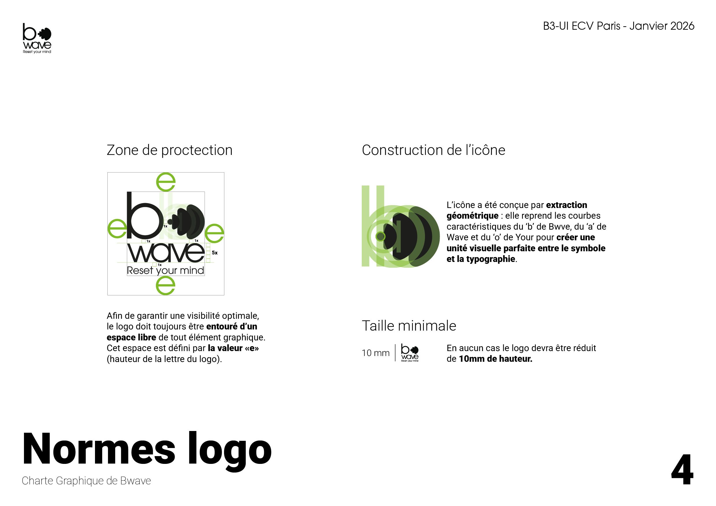
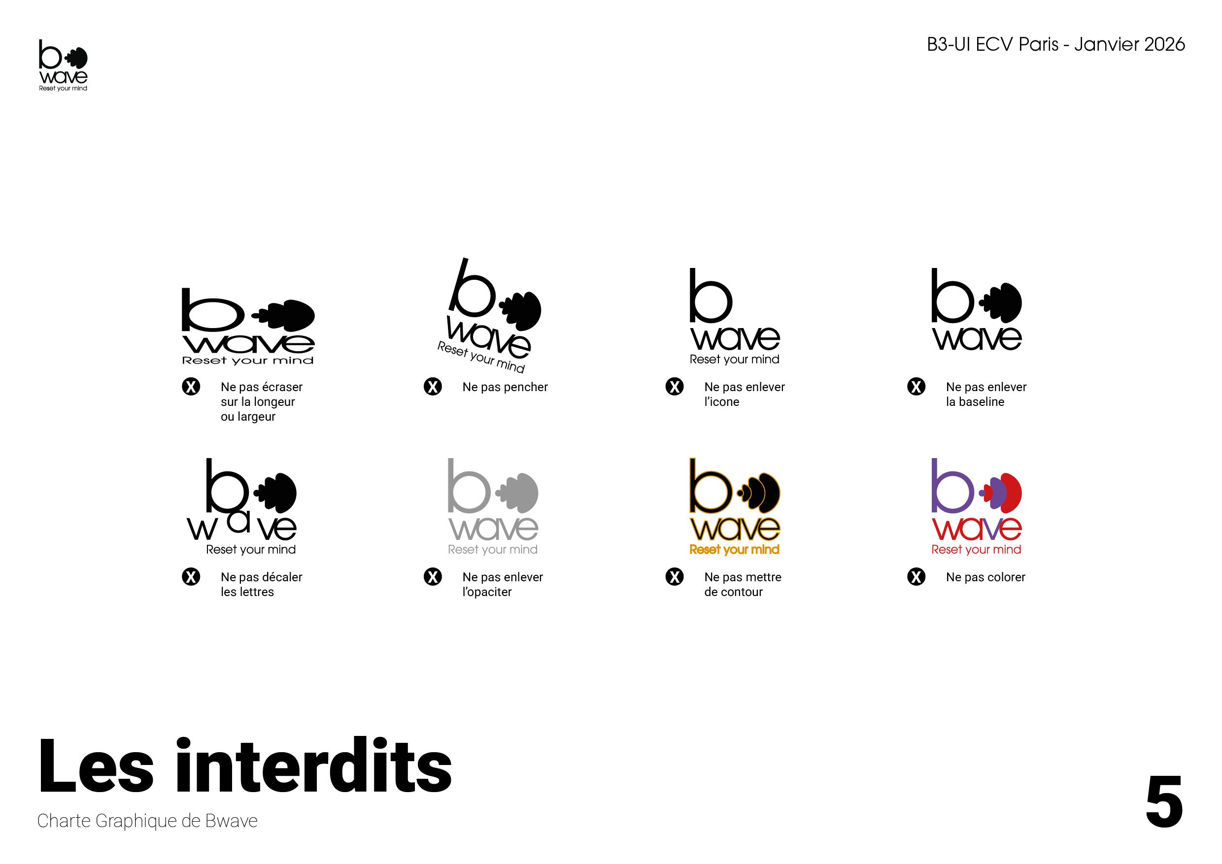
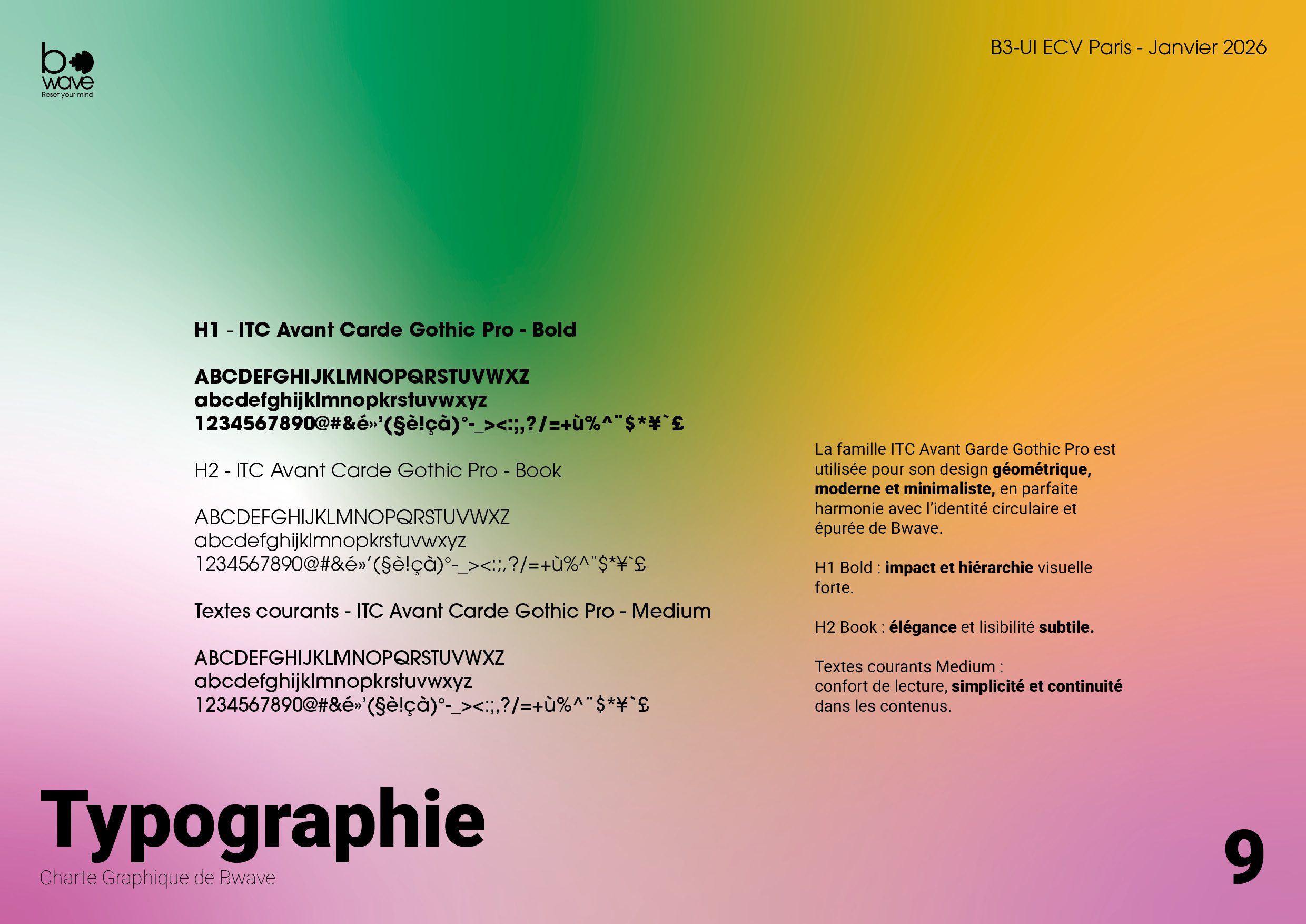
The design approach for the Bwave connected speaker centered on a rigorous visual grammar, balancing pure geometry, organic softness, and functional minimalism to visually express the serenity promised to the user. The logotype was conceived as an indivisible typographic block shaped by form extraction: the icon, embodying sound wave propagation, draws from the internal vector curves and circular counterforms of key letters to establish optical continuity between lettering and glyph. Choosing the ITC Avant Garde Gothic Pro, typeface across hierarchical weights, Bold, Book, and Medium, roots the brand in a modernist, refined, and timeless aesthetic.
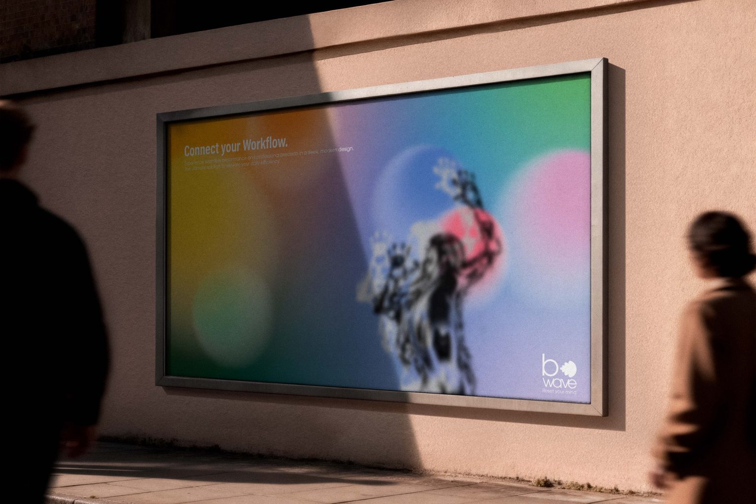
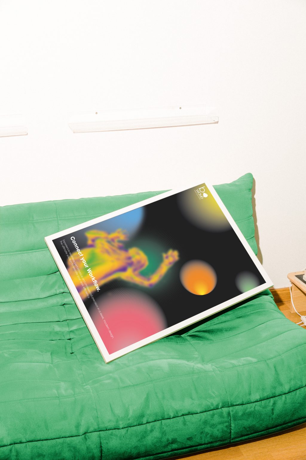
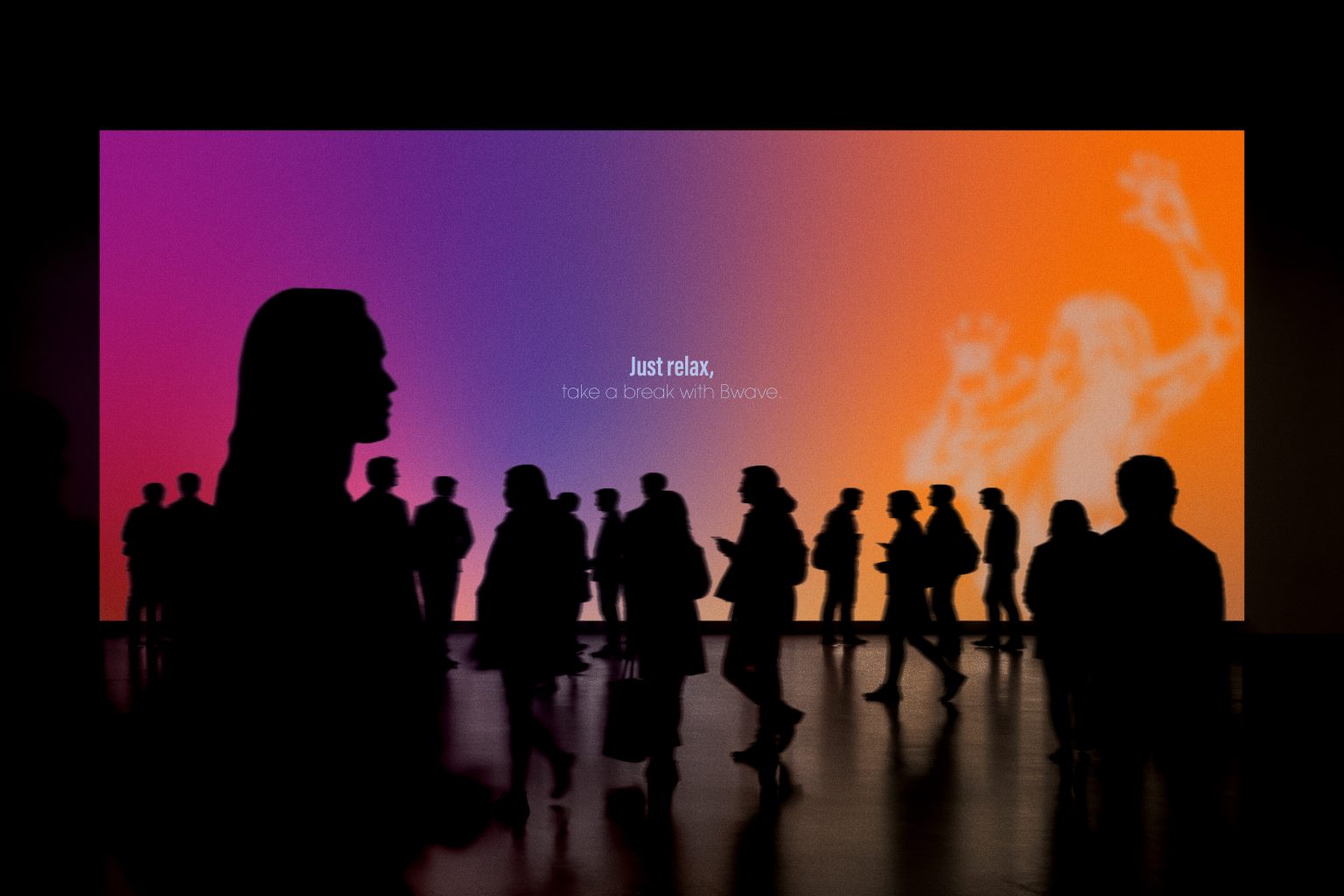
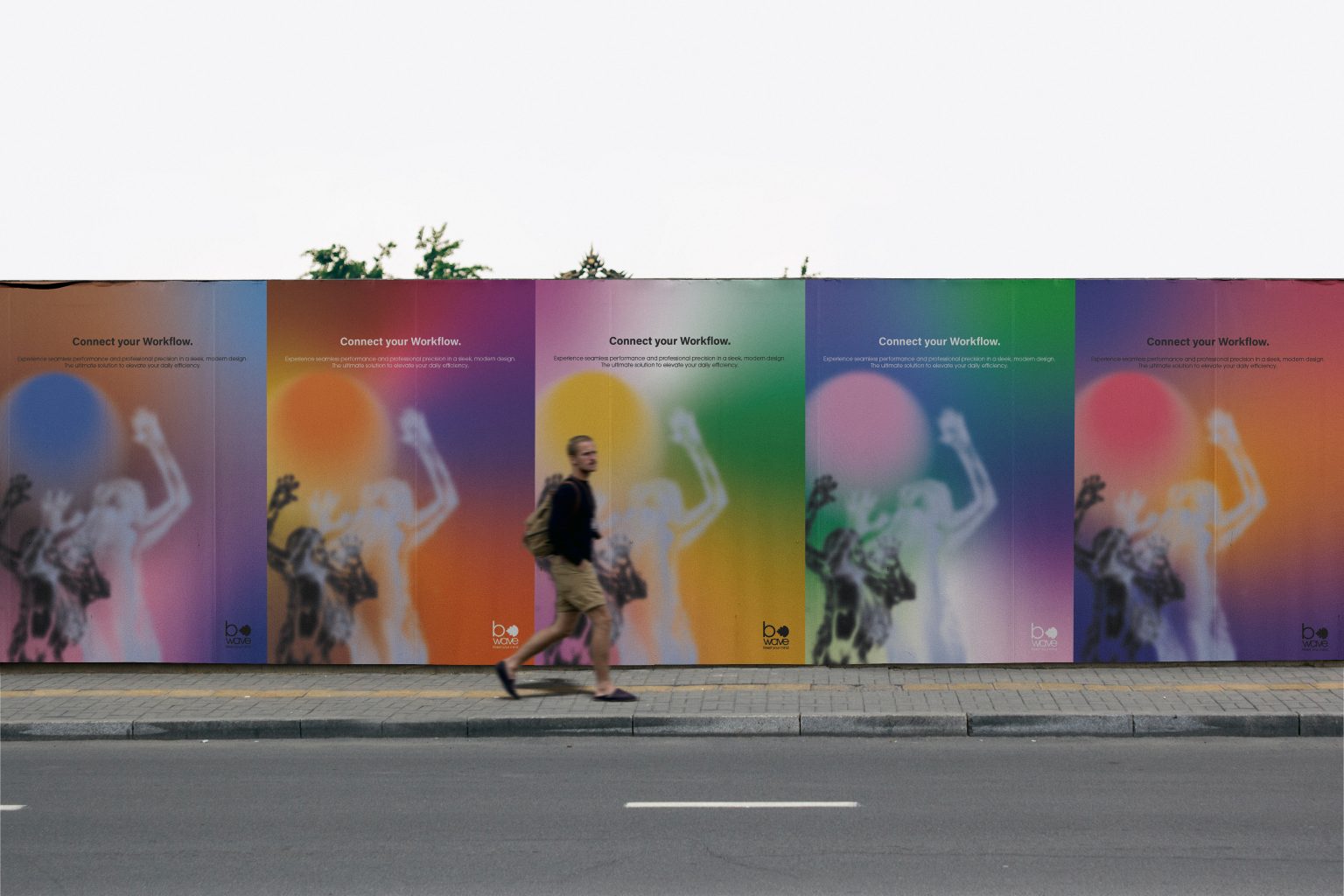
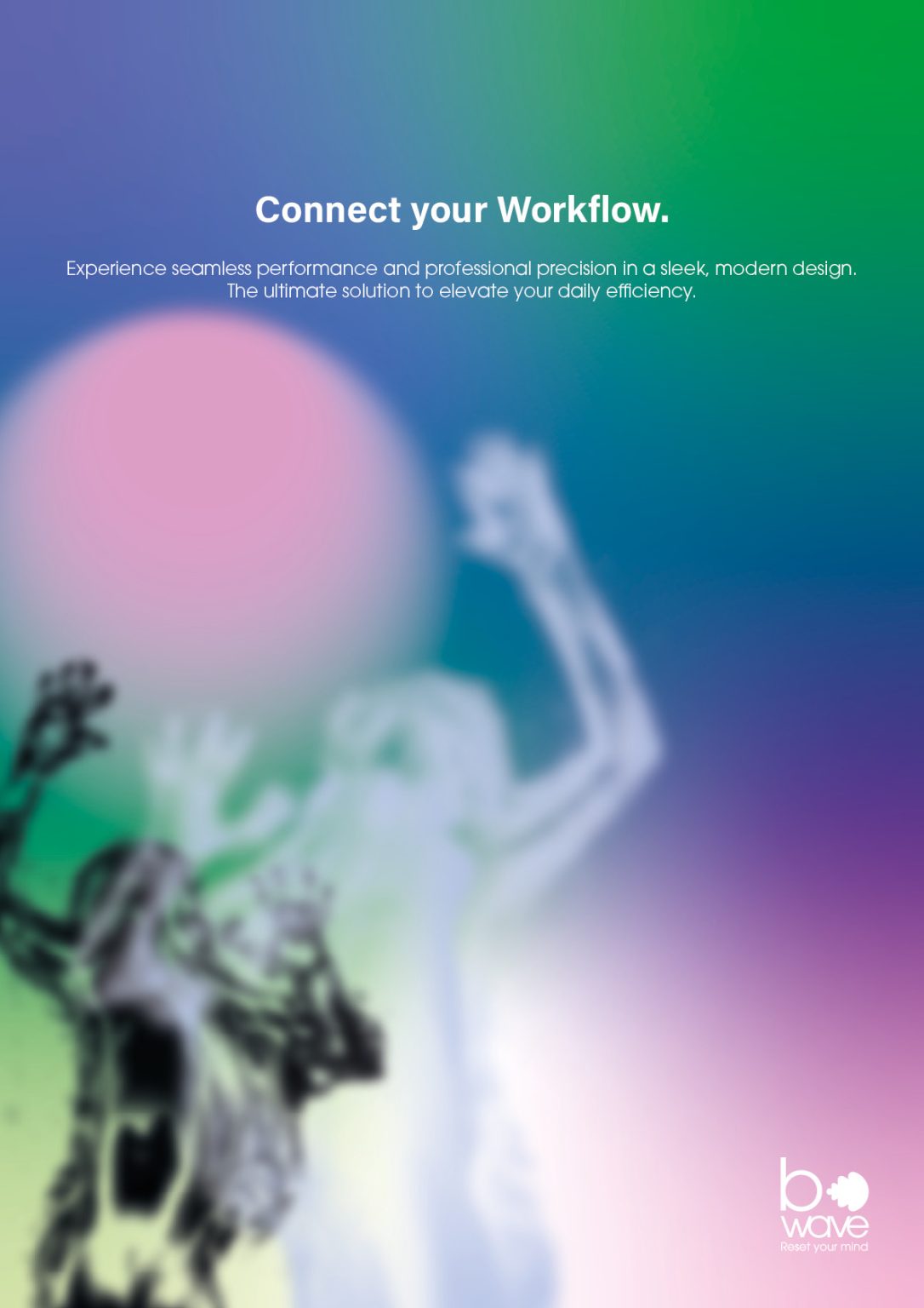
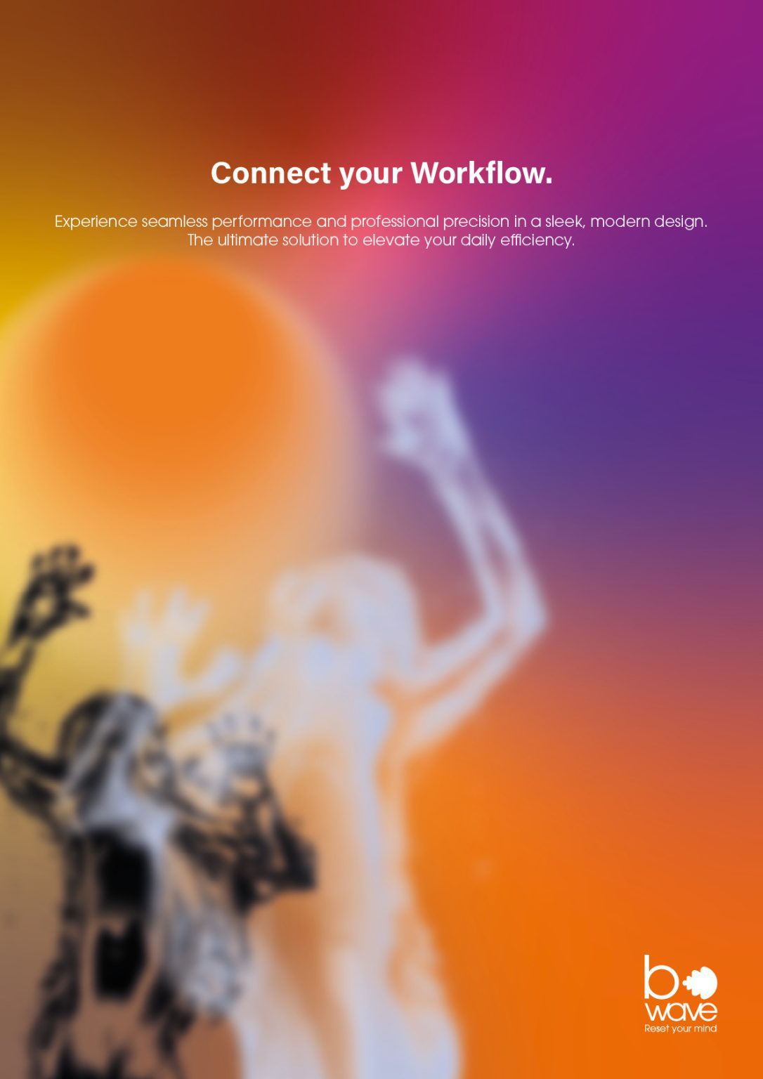
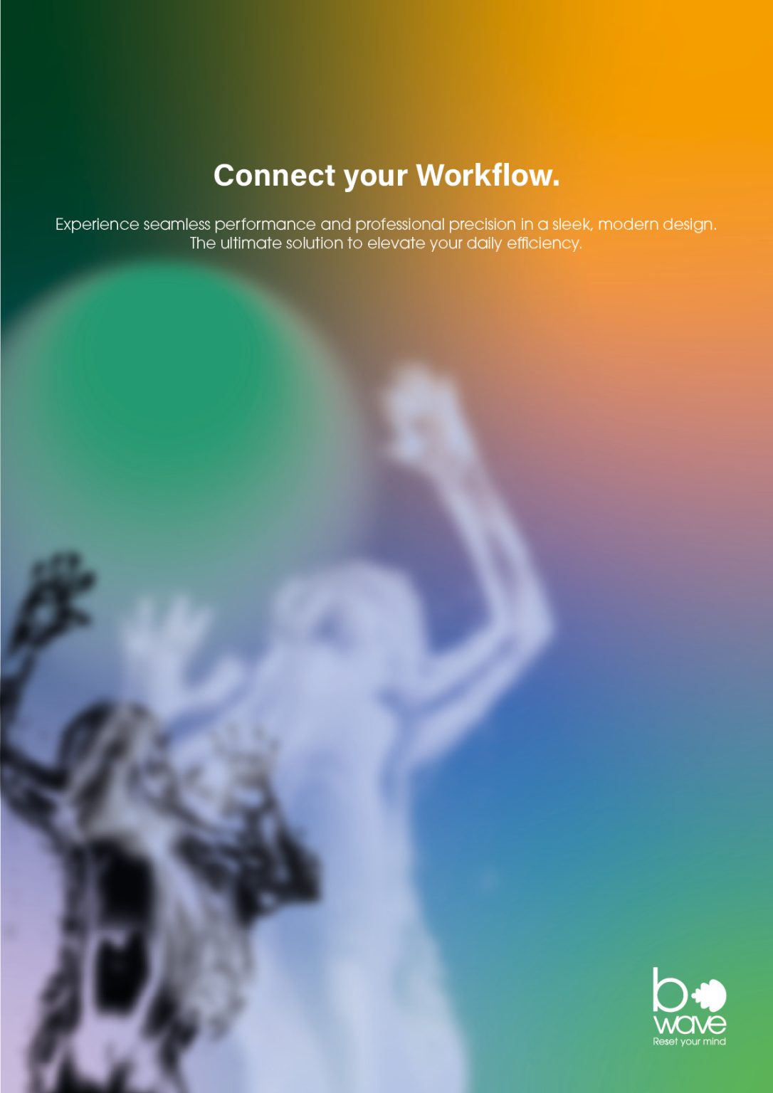
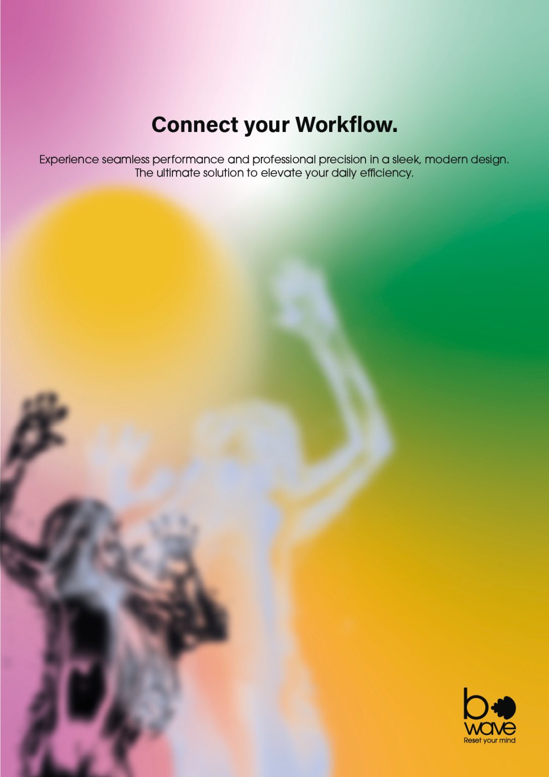
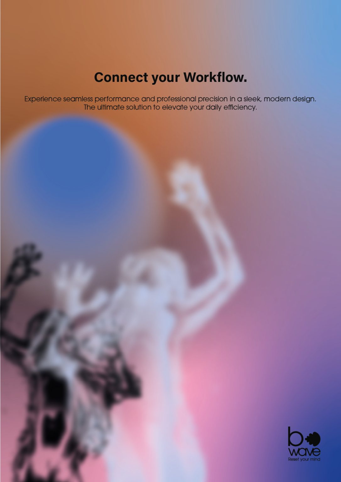
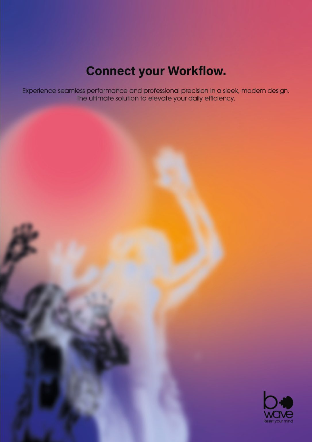
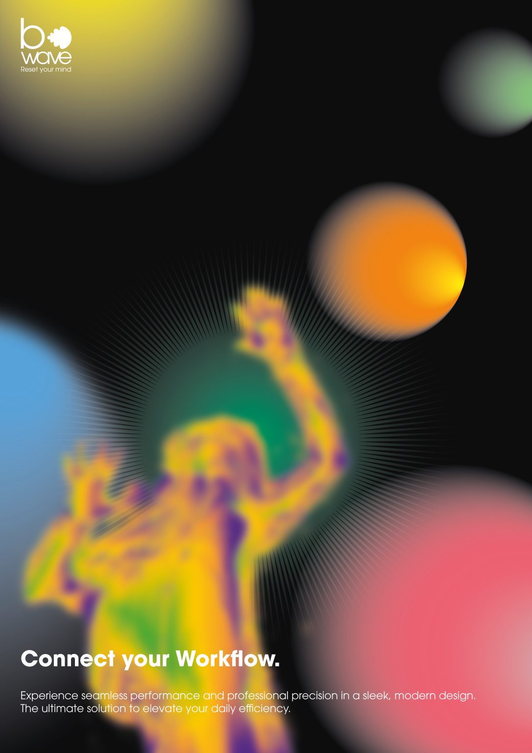
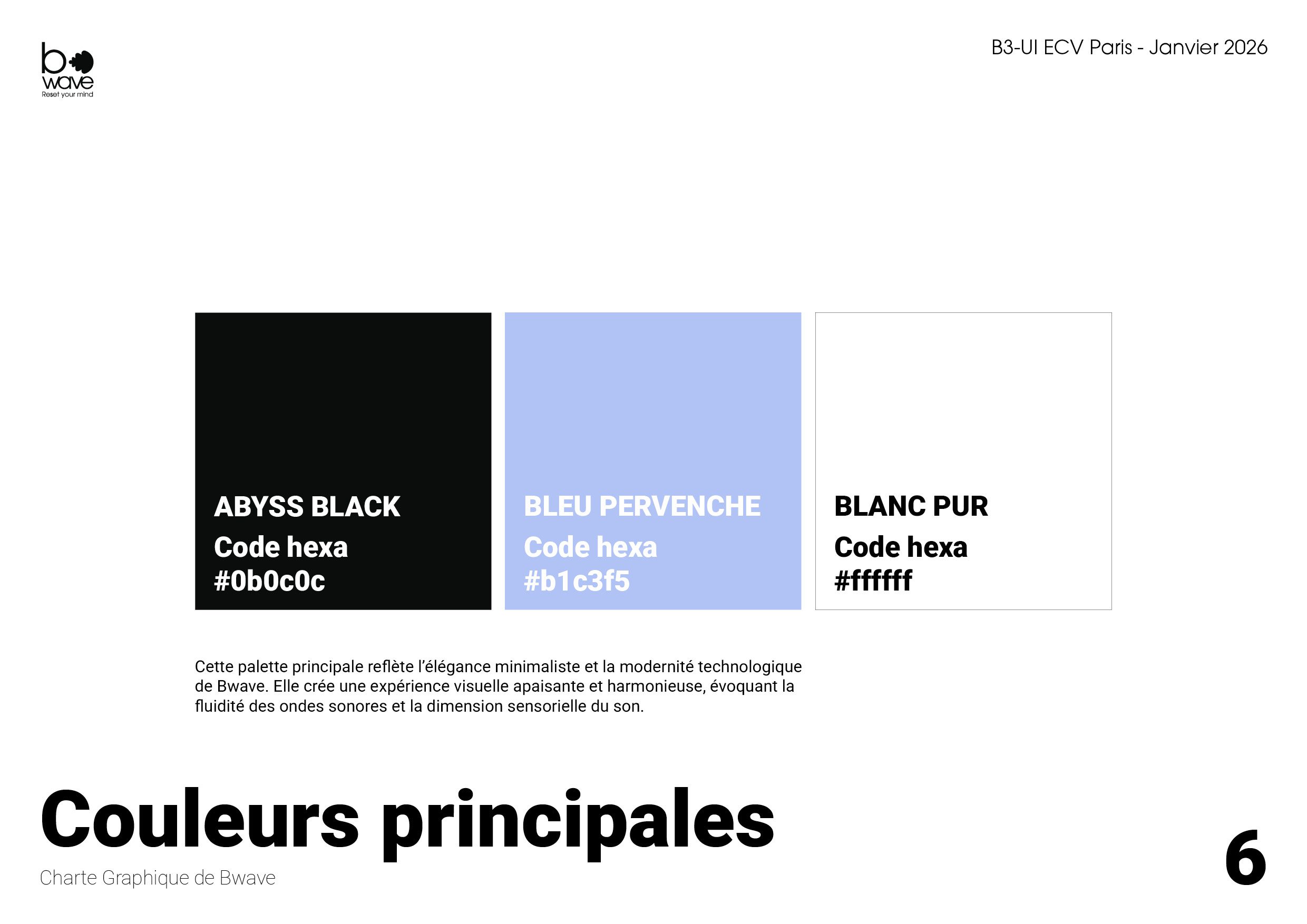
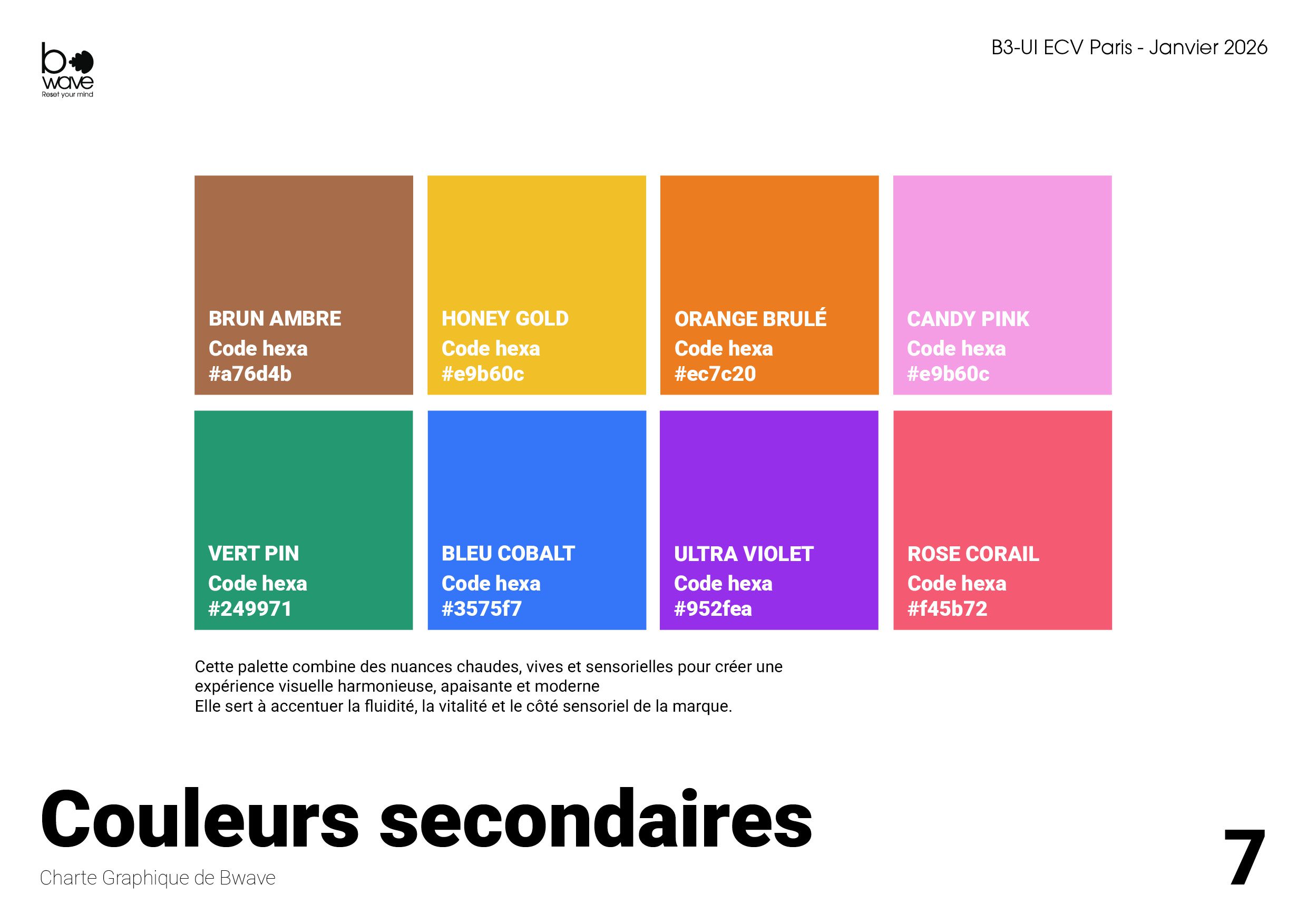
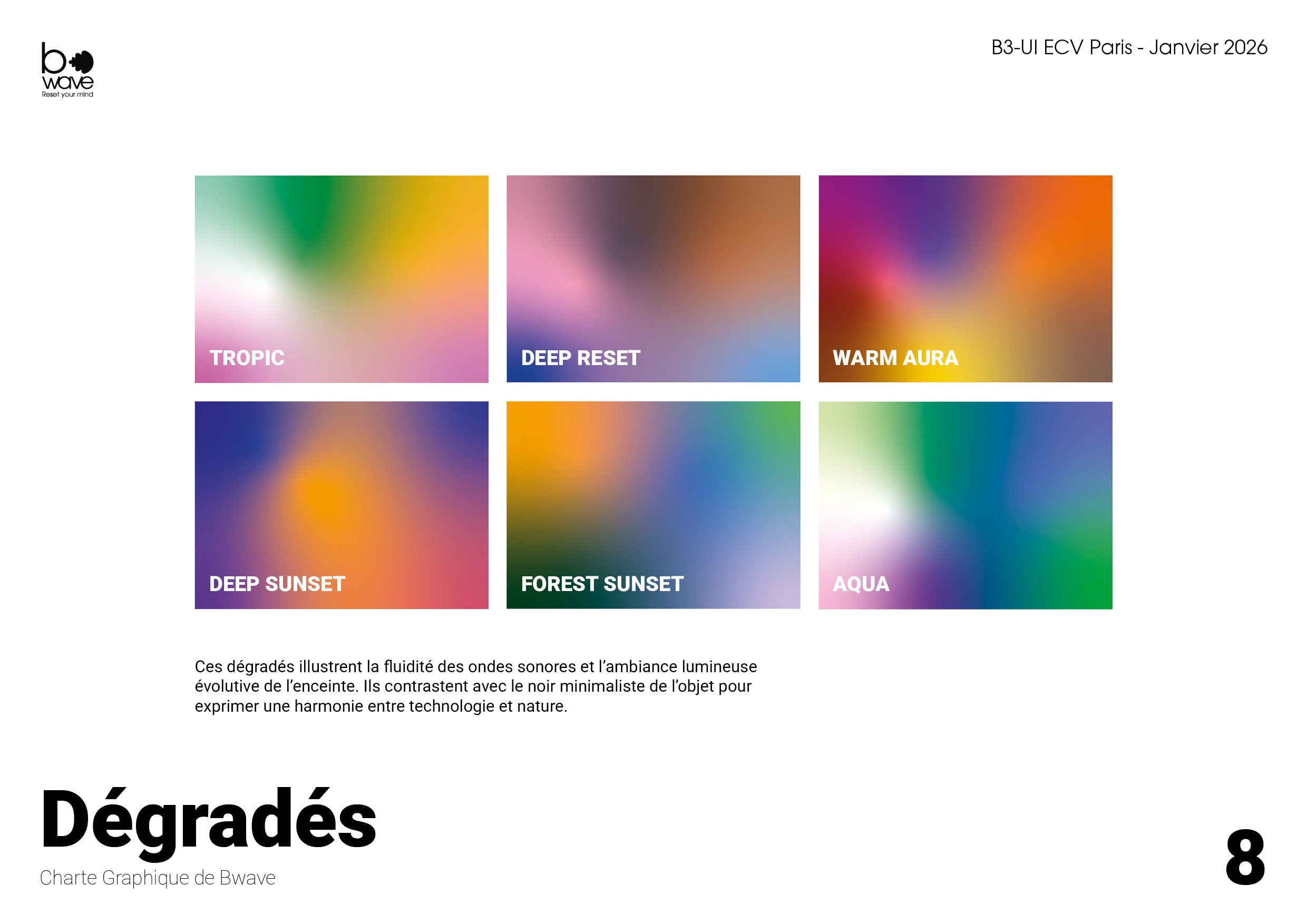
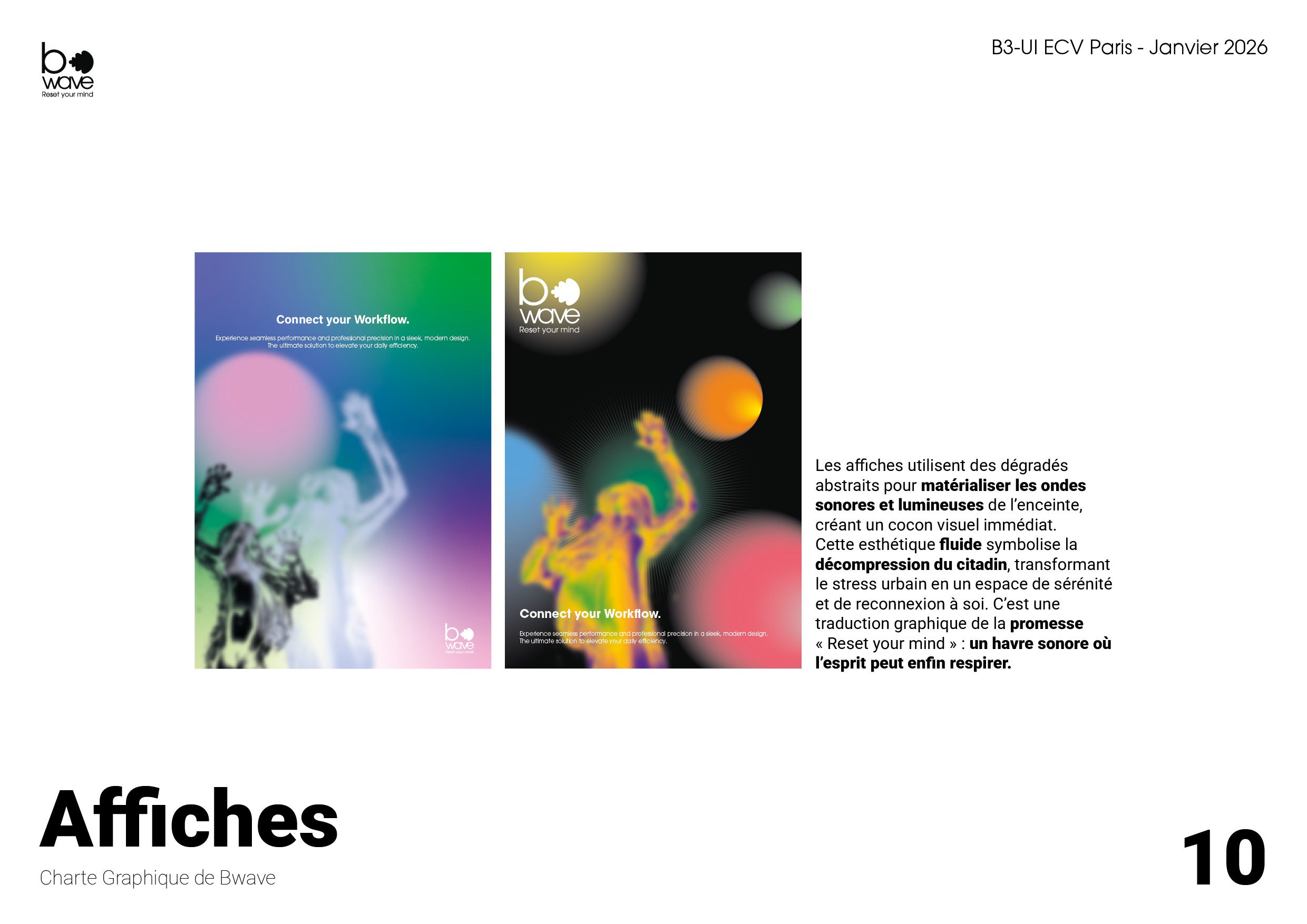
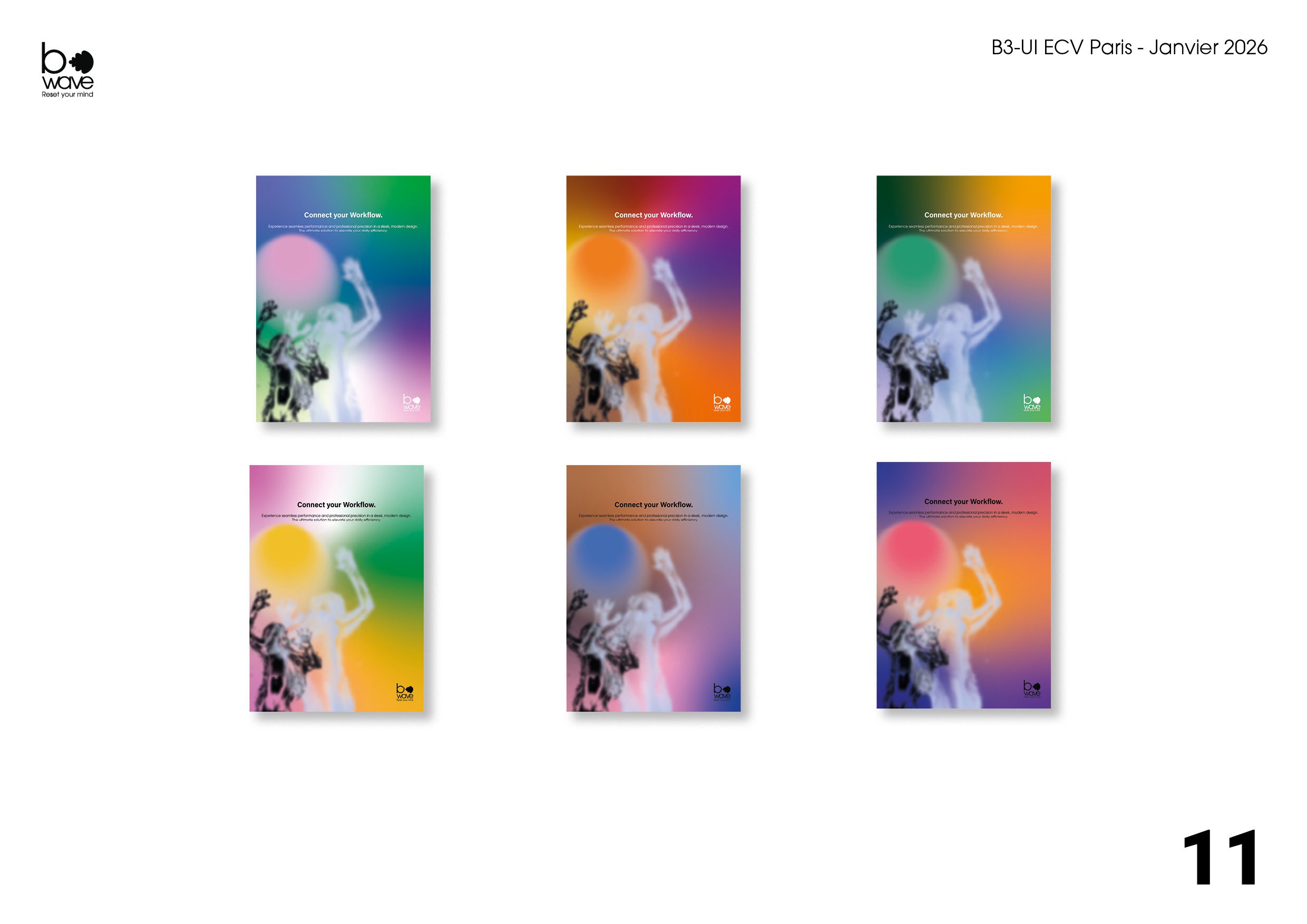
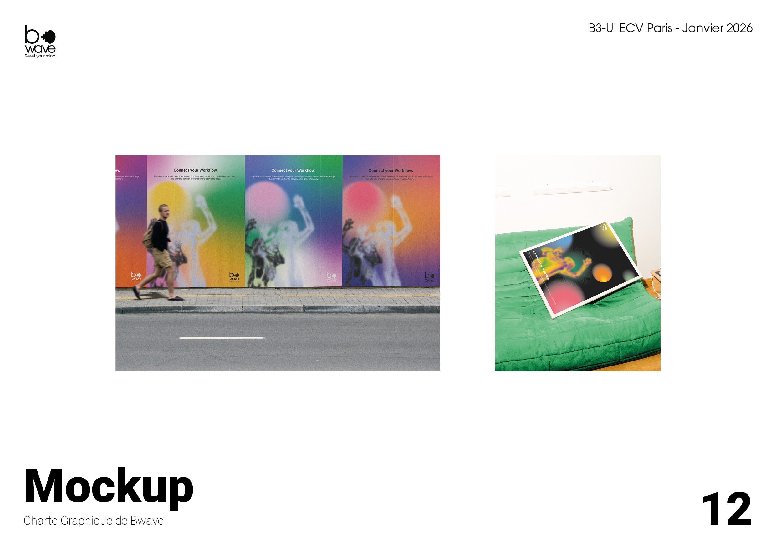
The brand universe extends this pursuit of calm through a high contrast yet subdued color palette, pairing the depth of Abyss Black with the subtlety of Periwinkle Blue, rounded out by soft chromatic gradients. In the art direction for the “Connect your Workflow” campaign, these spectral halos appear superimposed over textured silhouettes, translating acoustic resonance and sensory relief into visual form. This layout approach, combining generous whitespace, minimal typography, and gentle light transitions, maintains complete harmony dedicated to calmness and mental clarity.
Nous utilisons des cookies pour vous garantir la meilleure expérience sur notre site web. Si vous continuez à utiliser ce site, nous supposerons que vous en êtes satisfait.