March 2024
Photomontage
Print Art Direction
Editorial Design
Illustrator – Photoshop
About
Design and production of a playing card deck for Art of Play, inspired by the disruptive ethos of postmodern graphic design. This project interrogates institutional symbols of power through a subversive reinterpretation of British monarchical iconography.
Concept & Experience
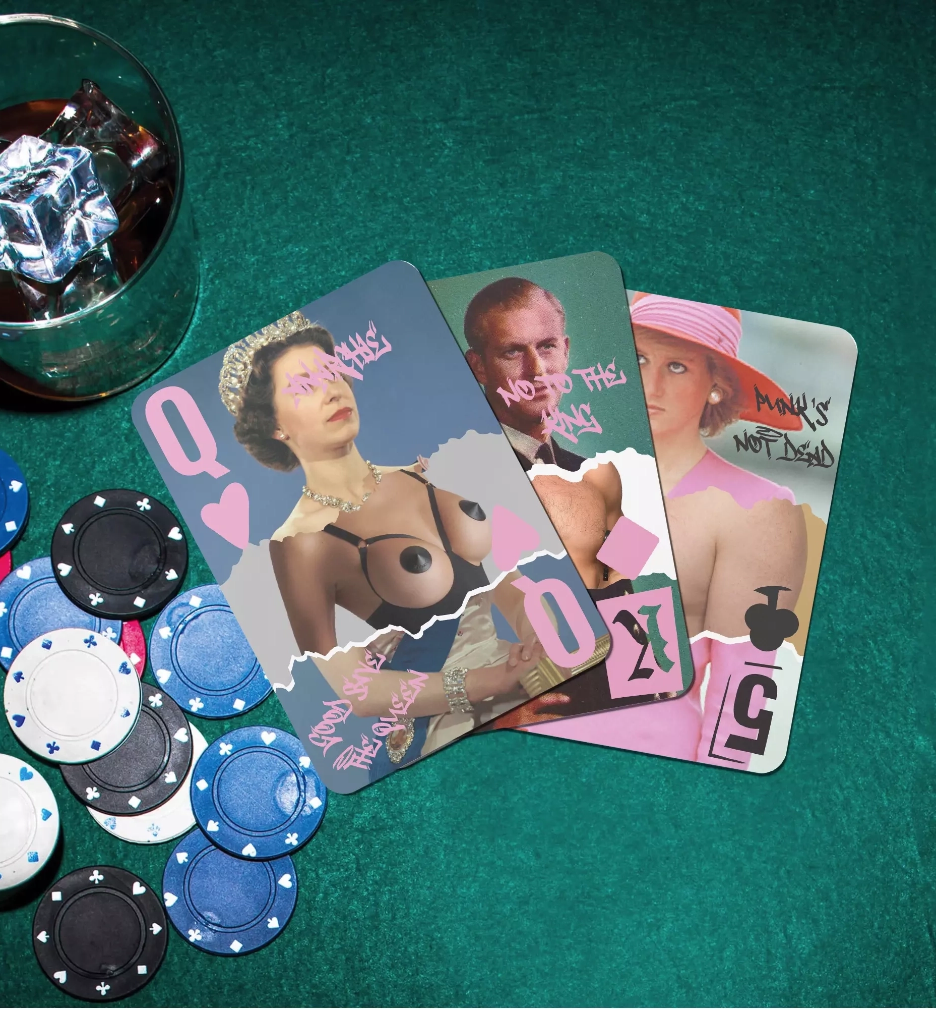
Reinterpreting royal heraldry through postmodern visual codes forms the conceptual foundation of this deck. Designed to disrupt conventions, this project transforms the traditional 54-card format into a bold editorial collectible that challenges the player at every draw.
Specifically, the handling experience relies on calculated rupture. Complete asymmetry across face cards strips away standard visual expectations. Furthermore, confronting rigid sovereign imagery with exposed bodies and an unapologetic candy pink for red suits sparks constant aesthetic tension.
Consequently, a standard hand of poker evolves into a raw, subversive engagement somewhere between high-society pageantry, political parody, and DIY zine culture.

Creative Process
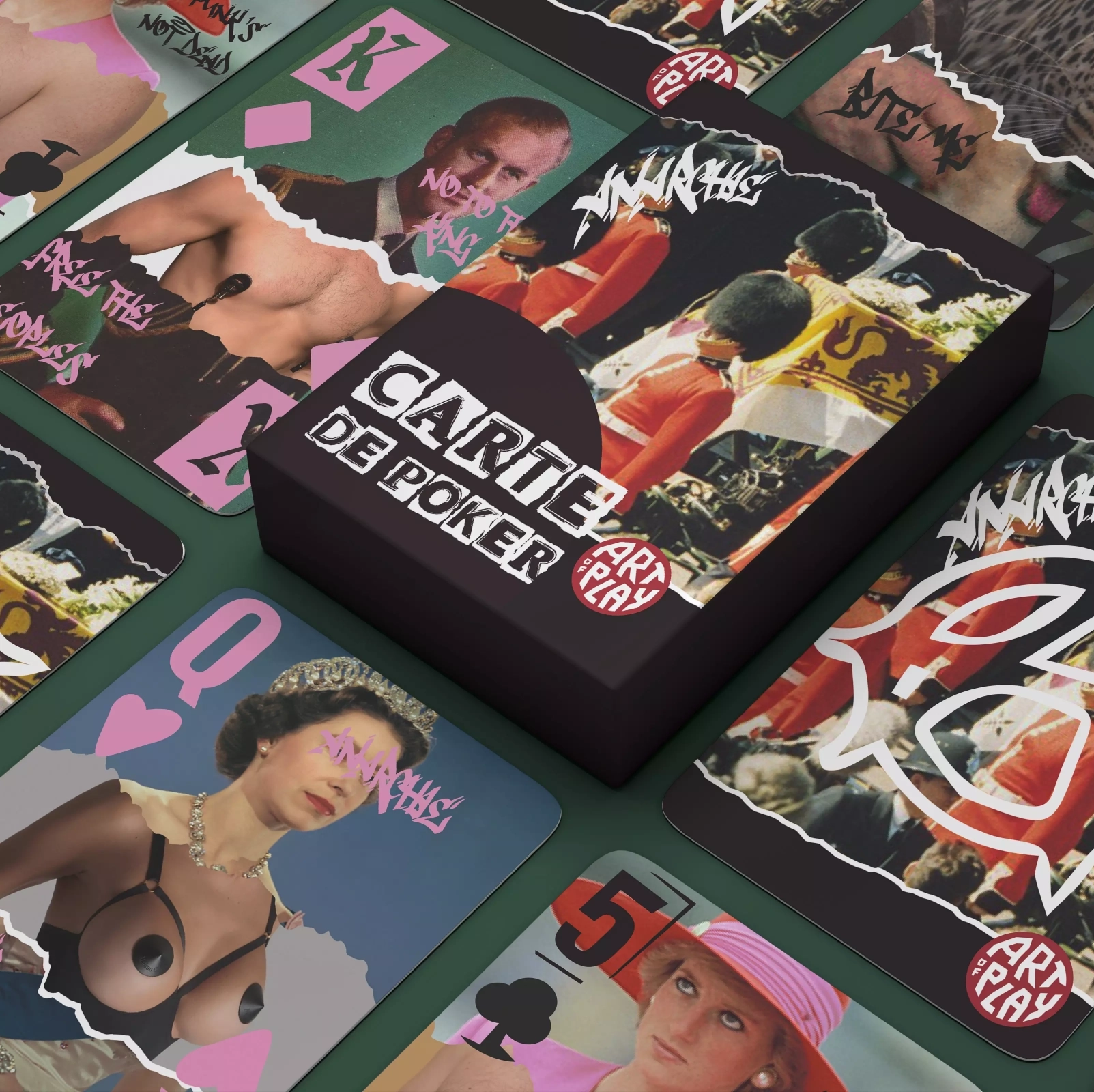
Development began with rigorous archival research and digital slicing to assemble each royal face card. Channeling Dadaist and punk collage traditions, solemn institutional portraits were deconstructed and merged with anatomical photography through torn edges, raw grain, and layered textures—exposing physical vulnerability beneath the official state regalia.
Next, the methodology centered on dismantling conventional typographic grids and game iconography. Card suits were redrawn from scratch with a brutalist, asymmetrical treatment to deliberately break away from standard axial mirrors. To deepen the visual stratification, urban graffiti interventions using the typeface Another Tag were layered directly across the compositions, reinforced by the expressive counter-culture energy of Punk Attitude and Hiroshima Vibes.
Finally, the tuck box was engineered as the ultimate distillation of this subversive identity—a tactile outer sleeve that immediately signals the graphic radicality contained within.